

Section
Introduction
Section titled “Introduction”Section groups related fields under a heading with optional description, icon, aside layout, and collapsible body. Compact mode tightens vertical rhythm for dense admin forms.
Each variation below includes a short explanation, the fluent API to paste into your schema, and a screenshot of the rendered control.
Basic section
Section titled “Basic section”Heading plus nested schema.
Section.make('profile') .heading('Profile') .schema([TextInput.make('name').label('Name')])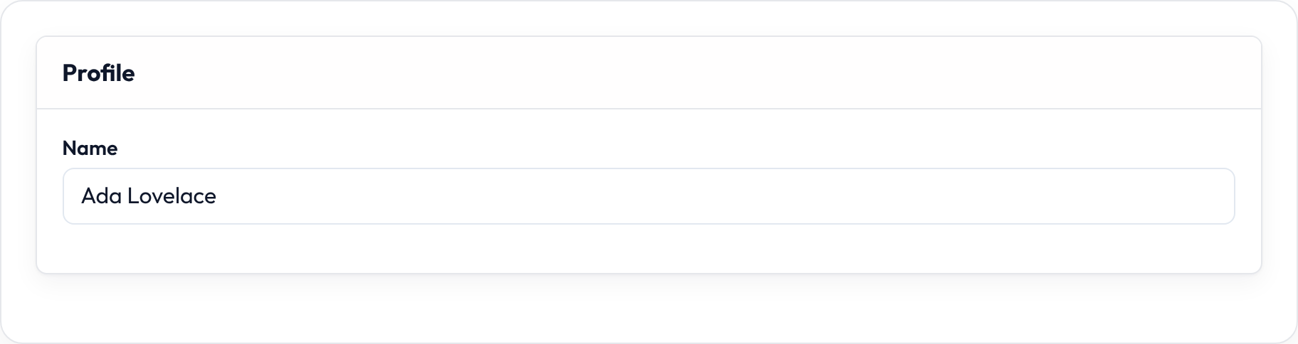

Collapsible section
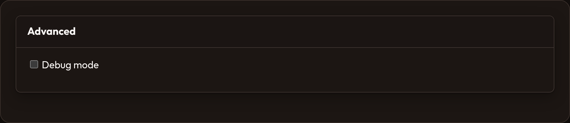
Section titled “Collapsible section”Advanced blocks collapsed by default.
Section.make('advanced') .heading('Advanced') .collapsible() .collapsed() .schema([Toggle.make('debug')])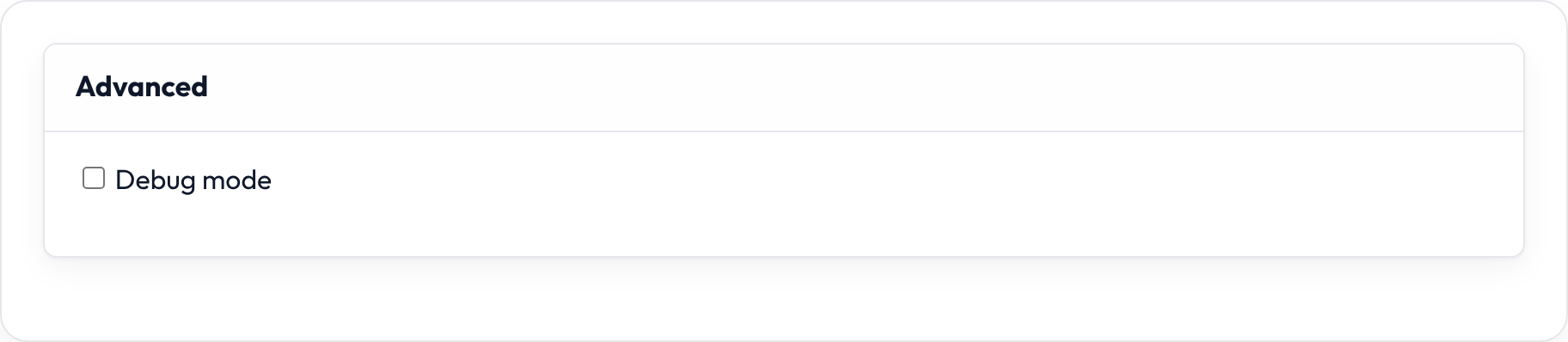
Compact section
Section titled “Compact section”Tighter spacing with optional icon.
Section.make('profile') .heading('Profile') .compact() .icon('heroicon-o-user') .schema([...])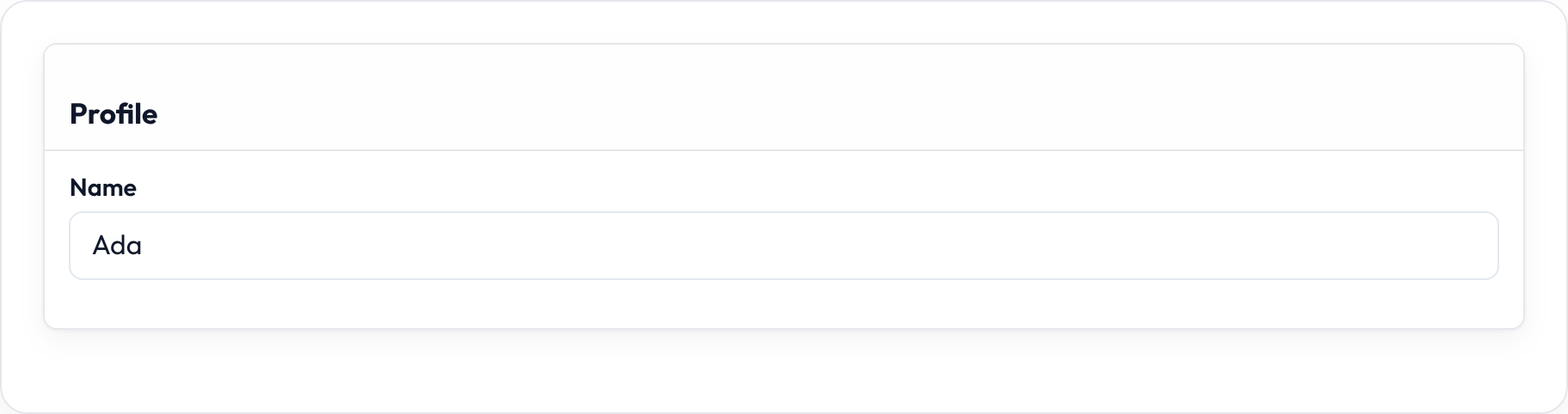

Description
Section titled “Description”.description(...) is supporting copy under the heading — use it for “why this group exists” rather than field-level helpers.
Section.make("billing") .heading("Billing") .description("Shown on invoices sent to the tenant owner.") .schema([TextInput.make("legal_name").required()])

.aside() moves the heading into a side column so the fields sit beside the title on wide screens.
Section.make("profile") .heading("Profile") .description("Public author details.") .aside() .schema([TextInput.make("name").required()])

.secondary() mutes the chrome. .persist_collapsed() keeps the open/closed state in the browser for collapsible sections.
Closures work on .label(), .helper_text(), .placeholder(), .visible(), .disabled(), and .required() where applicable — see Form closures.