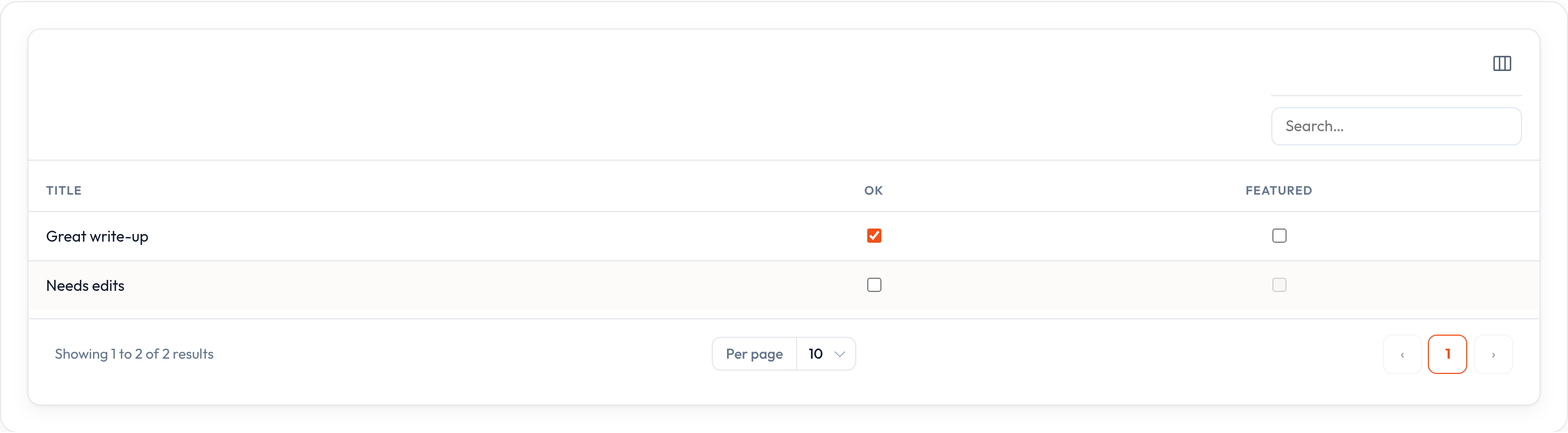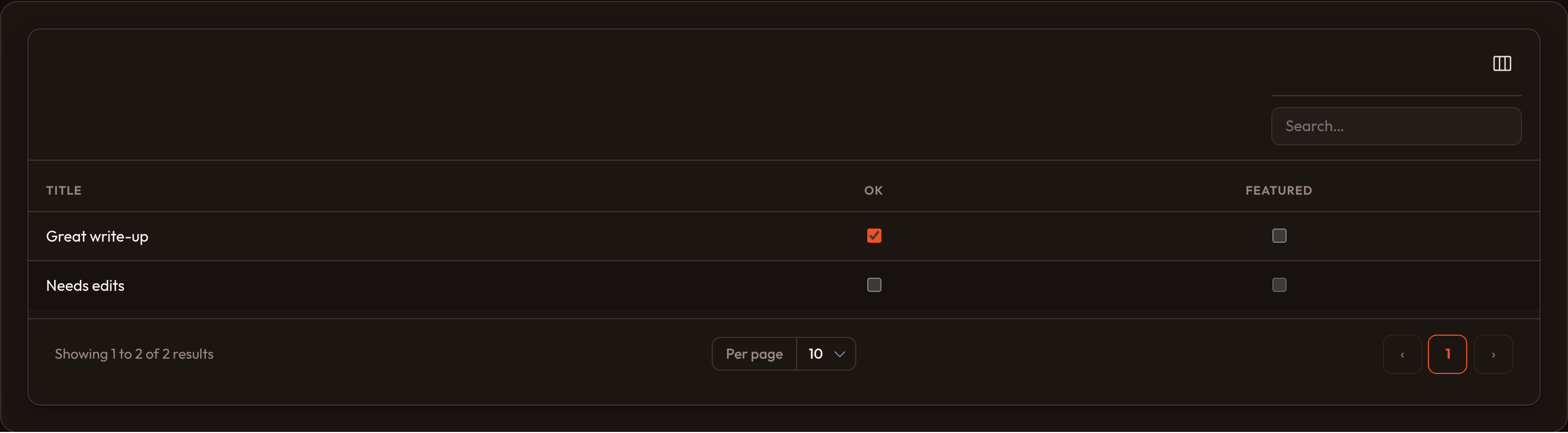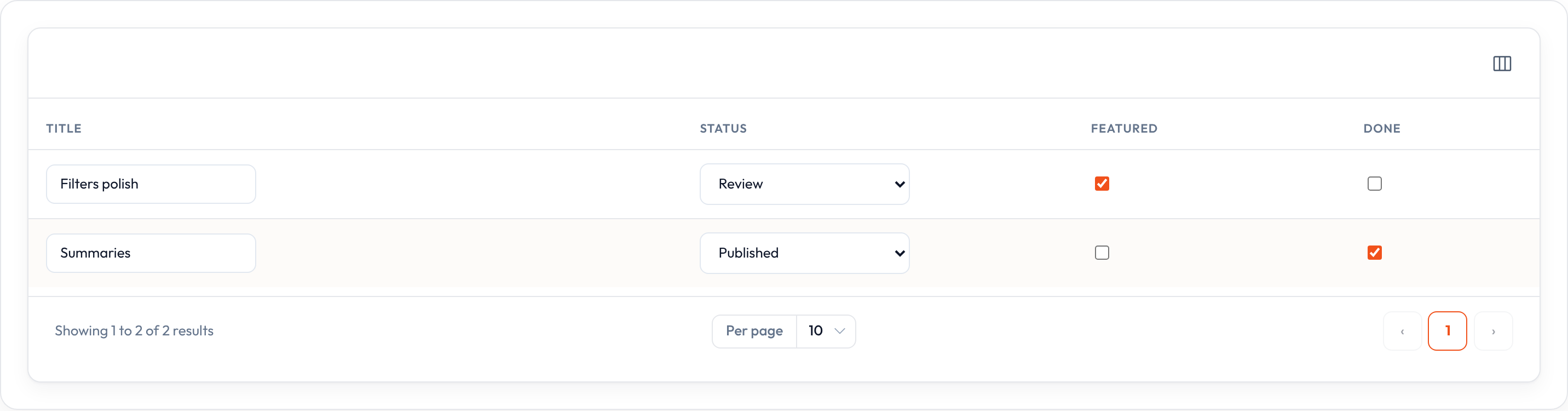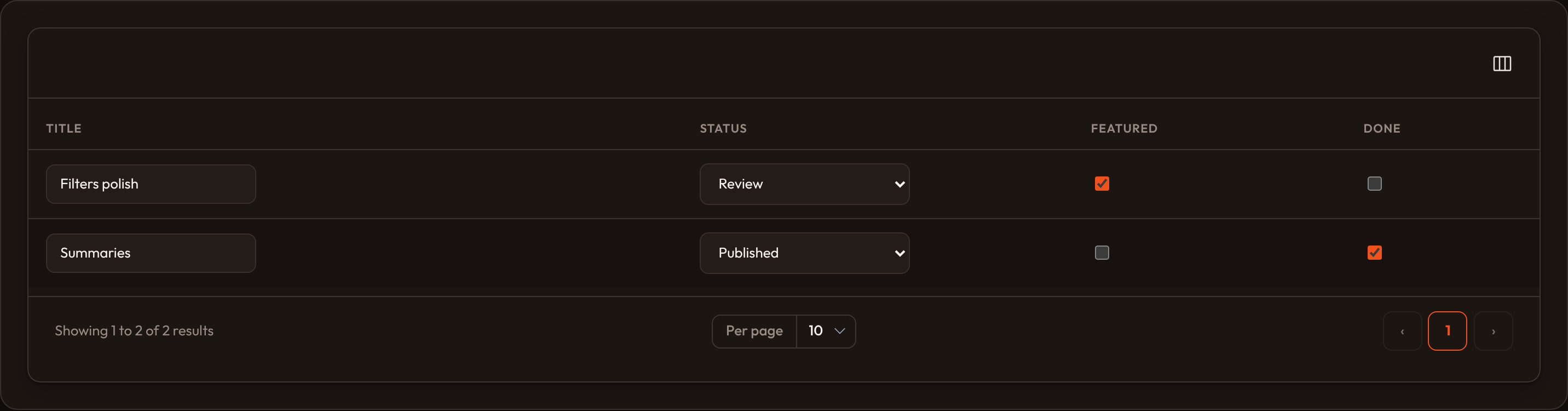

Checkbox column
CheckboxColumn renders an inline checkbox for boolean fields, using the same editable-column pipeline as select, toggle, and text input:
from almasix.orbit.tables import CheckboxColumn
CheckboxColumn.make("approved")
Use ToggleColumn when a switch fits your UI better. Reach for CheckboxColumn for standard checkbox semantics — approval flags, permissions, bulk-style booleans.
Disabling the column
Section titled “Disabling the column”Prevent specific rows from being edited with .disabled():
CheckboxColumn.make("featured").disabled( lambda record=None, **_: not record.get("approved"),)Reacting to updates
Section titled “Reacting to updates”.before_state_updated() / .after_state_updated() run around the persisted change, each receiving (record, state, old):
CheckboxColumn.make("approved").after_state_updated( lambda record=None, state=None, old=None, **_: notify_review(record, state),)For read-only booleans, use BooleanColumn or TextColumn.boolean() instead — reserve CheckboxColumn for values operators should change from the index.
Full example
Section titled “Full example”from almasix.orbit.tables import Table, TextColumn, CheckboxColumn
Table.make("reviews").columns([ TextColumn.make("title").searchable(), CheckboxColumn.make("approved").label("OK").align_center(), CheckboxColumn.make("featured") .align_center() .disabled(lambda record=None, **_: not record.get("approved")),]).records([ {"id": 1, "title": "Great write-up", "approved": True, "featured": False}, {"id": 2, "title": "Needs edits", "approved": False, "featured": False},])Key methods
Section titled “Key methods”| Method | Effect |
|---|---|
.disabled(bool | callable) |
Prevent changes for a row |
.before_state_updated(callback) / .after_state_updated(callback) |
Hooks around persistence |
.label(...) / .align_center() / .sortable() |
Inherited shared helpers |
| Markup | data-orbit-column-edit="checkbox", data-record-id, data-column; class or-checkbox |
Preview
Section titled “Preview”