

Infolists overview
Introduction
Section titled “Introduction”Infolists are Orbit’s show / detail UI: a definition list of typed entries over one record. Where a form collects input, an infolist only displays — titles, badges, images, copyable slugs, and so on.
An Infolist is a Schema specialized for display. Compose entries with .schema([...]), nest Sections and Grids for layout, and render with .render(record). On a resource, implement infolist() and the view page (or ViewAction) shows it automatically.
By default each entry is stacked: a muted label above the value, like a clean detail sheet. Use .inline_label() when you need a dense side-by-side row instead.
from almasix.orbit.infolists import Infolist, TextEntry, ImageEntryfrom almasix.orbit.schemas import Section
Infolist.make("post").schema([    Section.make("basics").heading("Basics").schema([        TextEntry.make("title").weight("bold"),        TextEntry.make("status").badge().color("success"),        TextEntry.make("slug").copyable(),        ImageEntry.make("cover").circular(),    ]),])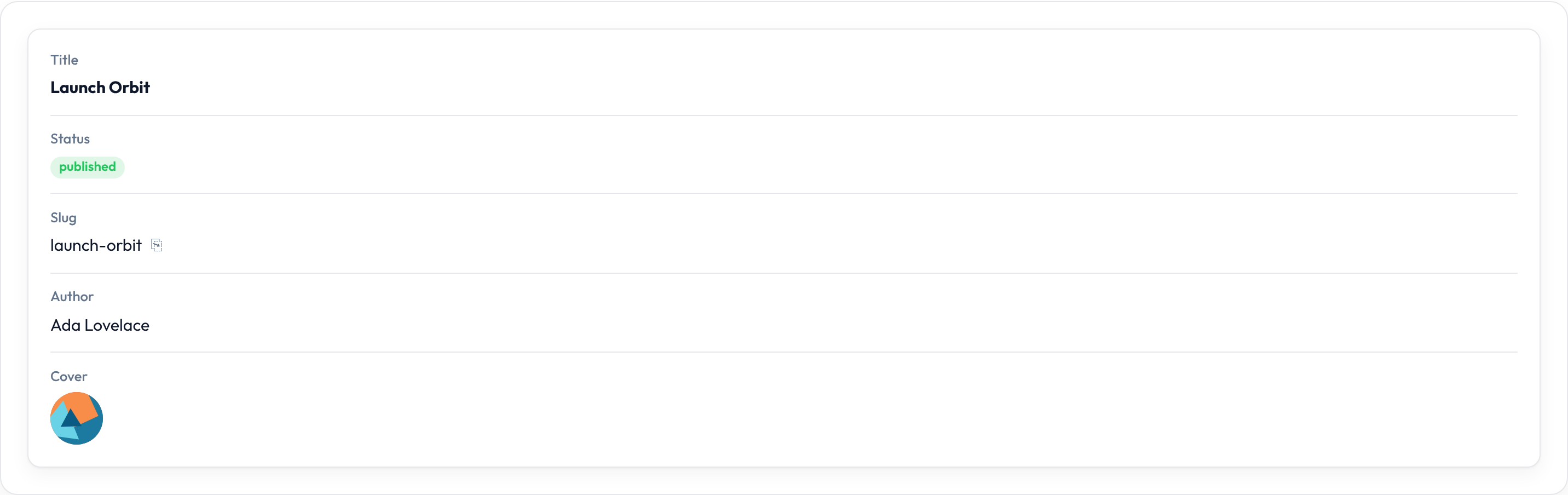
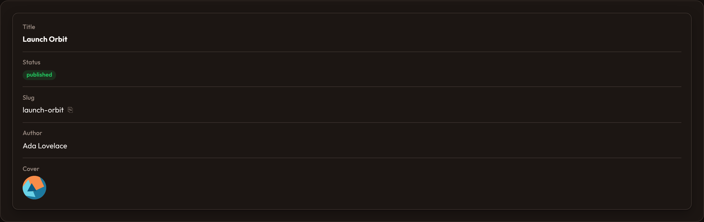
Markup is a <dl class="or-infolist"> wrapping entry chrome (or-entry with <dt> / <dd>). Call .columns(2) (or 3 / 4) on the infolist for a multi-column grid of those stacked entries.
Entry types
Section titled “Entry types”Every display control is an entry under almasix.orbit.infolists. Entries share chrome (label, hint, helper, affixes, placeholders) and resolve state from the record by name (including author.name dot paths).
| Entry | Use when |
|---|---|
| Text entry | Default strings, badges, dates, money, markdown |
| Icon entry | Icon-forward or boolean check / x |
| Image entry | Avatars, covers, stacked images |
| Color entry | Hex / color swatches |
| Code entry | Monospace / JSON / source |
| Key-value entry | Dict-ish two-column tables |
| Repeatable entry | Nested entry schema over a list |
| View entry | Custom HTML escape hatch |
from almasix.orbit.infolists import TextEntry, IconEntry, ColorEntry
TextEntry.make("title").weight("bold")IconEntry.make("featured").boolean()ColorEntry.make("accent").copyable()
On a resource
Section titled “On a resource”Wire the builder on the resource; ViewRecord renders it automatically.
from almasix.orbit.infolists import Infolist, TextEntry
@classmethoddef infolist(cls, infolist: Infolist) -> Infolist:    return infolist.schema([        TextEntry.make("title"),        TextEntry.make("status").badge(),    ])
Then PostResource.get_infolist().render(record) on custom pages, or open the resource view route.
Setting an entry’s label
Section titled “Setting an entry’s label”By default Orbit humanizes the name (first_name → First Name). Override with .label(...) when UI copy should differ from the state key. Callables receive injected utilities such as record — see Utility injection.
from almasix.orbit.infolists import TextEntry
TextEntry.make("name")    .label("Full name")    .helper_text("Shown on invoices and the public profile.")    .hint("Legal name")    .hint_icon("heroicon-m-information-circle")

Helper text and hints
Section titled “Helper text and hints”.helper_text(...) sits below the value; .hint(...) / .hint_icon(...) sit near the label — the same chrome pattern as form fields.
from almasix.orbit.infolists import TextEntry
TextEntry.make("email")    .label("Email")    .helper_text("Used for invoices and notifications.")    .hint("Primary")    .hint_icon("heroicon-m-envelope")

Hiding a label
Section titled “Hiding a label”.hidden_label() keeps an accessible name (screen-reader-only <dt>) while omitting the visible label row. Use it for hero titles, subtitle lines, or any value that already communicates its meaning.
from almasix.orbit.infolists import TextEntry
TextEntry.make("title").hidden_label().weight("bold").size("lg")TextEntry.make("subtitle").hidden_label().color("gray")

Inline labels
Section titled “Inline labels”The default layout stacks label above value. Call .inline_label() on an entry to place the label beside the value (two-column row) — useful for dense settings-style detail rows.
You can also call .inline_label() on a Section (or other layout): Orbit cascades inline_label to nested entries when that layout renders.
from almasix.orbit.infolists import TextEntry
TextEntry.make("timezone").label("Timezone").inline_label()TextEntry.make("locale").label("Locale").inline_label()TextEntry.make("email").label("Email").inline_label()

On narrow viewports, inline rows fold back to stacked so labels stay readable.
Placeholder vs default
Section titled “Placeholder vs default”.placeholder(...) is display-only chrome when state is empty — it does not become real state for Image / Color / Icon entries. .default(...) fills missing state before formatting (same idea as form fields).
from almasix.orbit.infolists import TextEntry
TextEntry.make("notes").placeholder("No notes yet")

from almasix.orbit.infolists import TextEntry
TextEntry.make("locale").default("en")

Custom state and formatting
Section titled “Custom state and formatting”.state(...) overrides record resolution (static or callable). .format_state_using(...) transforms the resolved value before display.
from almasix.orbit.infolists import TextEntry
TextEntry.make("email").format_state_using(lambda state, **_: str(state or "").upper())
TextEntry.make("full_name").state(    lambda record, **_: f"{record.get('first_name')} {record.get('last_name')}")

Copyable state
Section titled “Copyable state”.copyable() wraps the value with a clipboard control. Customize feedback with .copy_message(...) and .copy_message_duration(...) (milliseconds).
from almasix.orbit.infolists import TextEntry
TextEntry.make("slug")    .copyable()    .copy_message("Copied!")    .copy_message_duration(1500)

Tooltips and alignment
Section titled “Tooltips and alignment”.tooltip(...) sets the title on the value cell. Align with .align_start() / .align_center() / .align_end() (or .alignment("end")).
from almasix.orbit.infolists import TextEntry
TextEntry.make("status")    .badge()    .color("success")    .tooltip("Visible on the public site")    .align_end()

Above / below / before / after content
Section titled “Above / below / before / after content”Slot helpers inject HTML around the label or value so you can decorate an entry without changing its state:
| Method | Placement |
|---|---|
.above_label / .below_label |
Around the <dt> |
.before_label / .after_label |
Inline before / after the label |
.above_content / .below_content |
Around the <dd> |
.before_content / .after_content |
Inline before / after the value |
from almasix.orbit.infolists import TextEntry
TextEntry.make("title")    .above_label('<span class="or-muted">Above label</span>')    .below_content('<span class="or-muted">Below content</span>')

Affix actions
Section titled “Affix actions”.prefix_action(...) / .suffix_action(...) mount named actions beside the value (Conduit mountAction).
from almasix.orbit.infolists import TextEntry
TextEntry.make("slug").prefix_action("edit").suffix_action("copy")

Extra attributes
Section titled “Extra attributes”.extra_attributes(...) and .extra_entry_wrapper_attributes(...) add HTML attributes to the entry wrapper — useful for test hooks, analytics, or host styling. Values may be callables evaluated at render time.
from almasix.orbit.infolists import TextEntry
TextEntry.make("title")    .label("Title")    .extra_attributes({"data-tour": "title"})    .extra_entry_wrapper_attributes({"data-qa": "post-title"})

Multi-column layout
Section titled “Multi-column layout”.columns(2) (or 3 / 4) lays entries out in a responsive grid. Each cell still uses the stacked label-above-value default unless you opt into .inline_label().
from almasix.orbit.infolists import Infolist, TextEntry
Infolist.make("post").columns(2).schema([    TextEntry.make("title"),    TextEntry.make("status").badge().color("success"),    TextEntry.make("email"),    TextEntry.make("slug").copyable(),])

Sections and grids
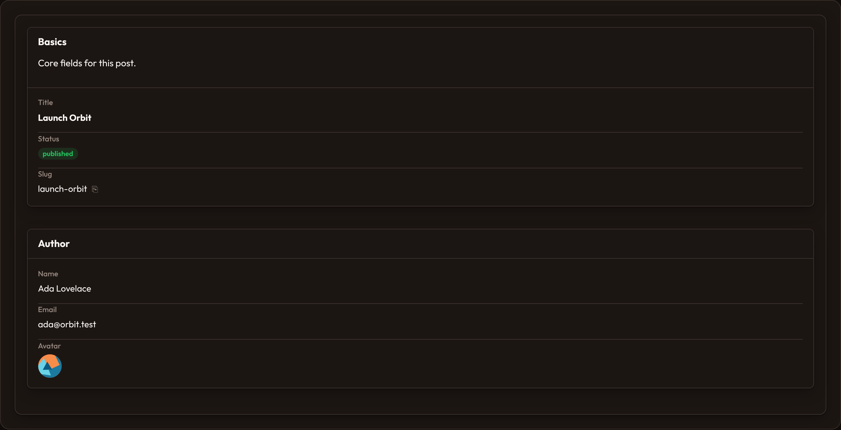
Section titled “Sections and grids”Nest Section and Grid inside the infolist schema to group related fields. Sections render a heading (and optional description) above their child entries — ideal for multi-block view pages.
from almasix.orbit.infolists import Infolist, TextEntry, ImageEntryfrom almasix.orbit.schemas import Section
Infolist.make("post").schema([    Section.make("basics")        .heading("Basics")        .description("Core fields for this post.")        .schema([            TextEntry.make("title").weight("bold"),            TextEntry.make("status").badge().color("success"),            TextEntry.make("slug").copyable(),        ]),    Section.make("author")        .heading("Author")        .schema([            TextEntry.make("author.name").label("Name"),            TextEntry.make("email"),            ImageEntry.make("photo").label("Avatar").circular().size(40),        ]),])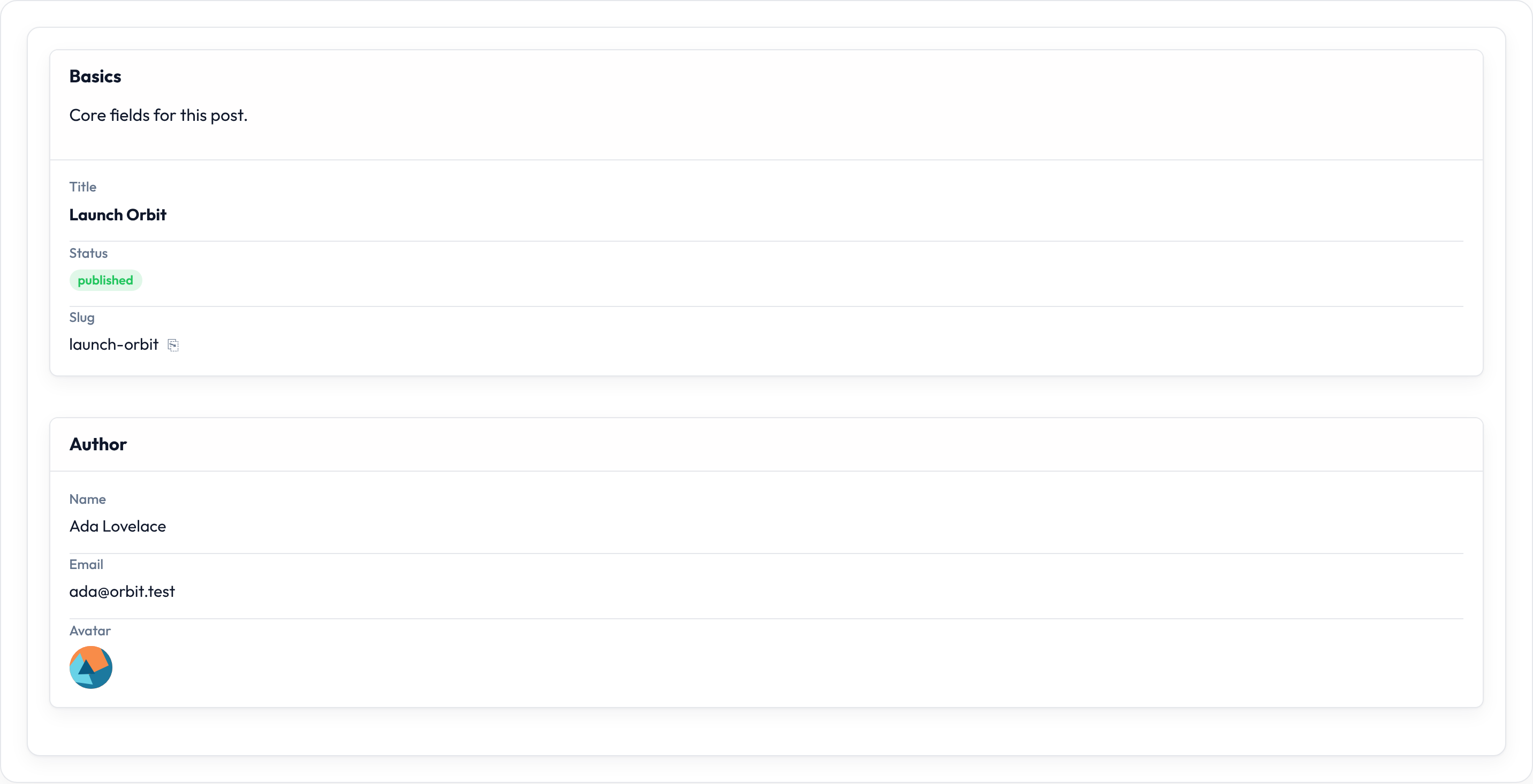
Utility injection / closures
Section titled “Utility injection / closures”When a fluent helper accepts a callable (.label, .state, .format_state_using, .tooltip, slot content, …), Orbit’s evaluate() injects only the kwargs the callable declares. Common utilities on view pages: state, record, and sometimes operation. See Support closures for the shared model.
from almasix.orbit.infolists import TextEntry
TextEntry.make("greeting").state(    lambda record, **_: f"Hello, {record.get('author', {}).get('name', 'friend')}")
TextEntry.make("email").format_state_using(lambda state, **_: str(state or "").lower())
Empty infolist → readonly form fallback
Section titled “Empty infolist → readonly form fallback”Leave infolist() empty (or return the untouched builder) and Orbit still gives you a show page. get_infolist() notices there are no components and projects the form schema into read-only TextEntrys:
from almasix.orbit.forms import Form, TextInput, Textareafrom almasix.orbit.infolists import Infolist
@classmethoddef form(cls, form: Form) -> Form:    return form.schema([        TextInput.make("title").required(),        TextInput.make("slug").required(),        Textarea.make("body"),    ])
@classmethoddef infolist(cls, infolist: Infolist) -> Infolist:    return infolist  # empty on purpose
Under the hood:
get_form().readonly()— same fields, edit chrome dialed down.- Walk nested layouts / repeaters for every
Field. - Emit
TextEntry.make(name).label(field.get_label())for each.
So create/edit and view stay in sync until you’re ready to hand-craft badges, prose, and copyable slugs. Define an explicit .schema([...]) whenever the show page should look different from the form — the fallback politely steps aside.
Shared Entry API cheat sheet
Section titled “Shared Entry API cheat sheet”| Method | Notes |
|---|---|
.label |
Override humanized name |
.hidden_label |
Screen-reader-only label |
.inline_label |
Label beside value (default is stacked) |
.helper_text / .hint / .hint_icon |
Chrome under / beside the entry |
.placeholder |
Empty-state display (not real state) |
.default |
Fallback when state is missing |
.state / .format_state_using |
Override / transform resolved value |
.copyable / .copy_message / .copy_message_duration |
Clipboard wrapper |
.tooltip |
title on the value cell |
.url / .open_url_in_new_tab |
Link the value |
.badge / .color / .icon / .icon_position / .icon_color |
Text chrome (also on TextEntry) |
.align_start / .align_center / .align_end |
Value alignment |
.prefix_action / .suffix_action |
Affix mountAction buttons |
.above_label / .below_content / … |
Content slots |
.extra_attributes / .extra_entry_wrapper_attributes |
Extra HTML attrs |
Text-specific formatters (money, dates, markdown, lists, …) live on Text entry.