

Overview
Introduction
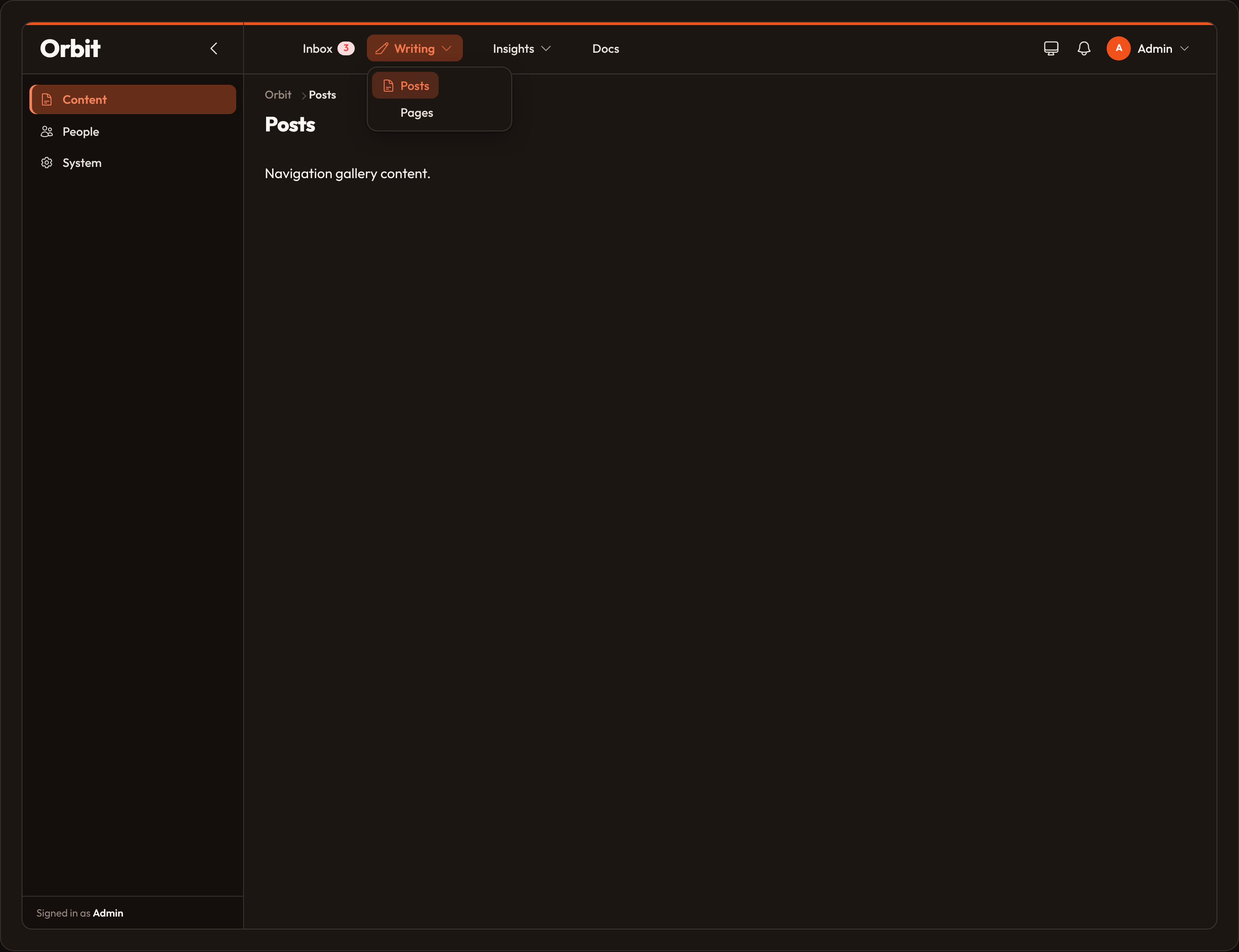
Section titled “Introduction”Navigation is the sorted set of links Orbit builds from resources, pages, clusters, and anything you register by hand. Layouts fold that list into a sidebar, a top bar, or both (Shamar-style apps).
from almasix.orbit import Panelfrom almasix.orbit.panels import NavigationGroup, NavigationItem, NavigationSubgroup
Panel.make("admin")    .path("admin")    .navigation_layout("apps")  # or "sidebar" | "top" | "sidebar_topbar"    .sidebar_collapsible()    .navigation_groups([        NavigationGroup.make("Content")            .icon("heroicon-o-document-text")            .sort(10),        NavigationGroup.make("People")            .icon("heroicon-o-users")            .sort(20),    ])    .navigation_subgroups([        NavigationSubgroup.make("Writing")            .parent("Content")            .icon("heroicon-o-pencil-square")            .sort(5),    ])    .navigation_items([        NavigationItem.make("reports")            .label("Reports")            .icon("heroicon-o-chart-bar")            .url("/admin/reports")            .group("Content")            .subgroup("Insights")            .sort(50),    ])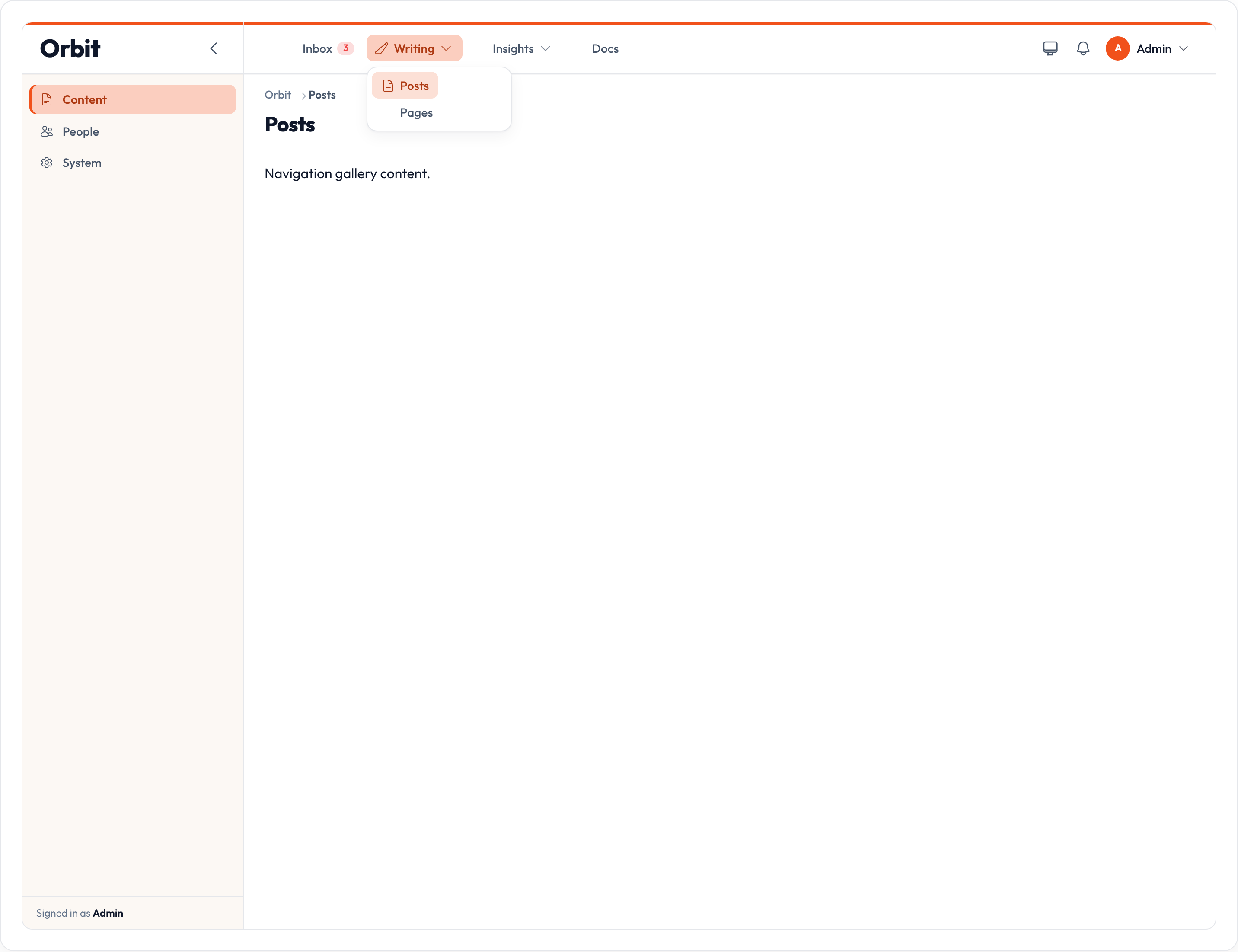
Related: Custom pages, User menu, Clusters.
From resources & pages
Section titled “From resources & pages”Class vars become nav dicts automatically. You do not need to register NavigationGroups for those labels to appear — groups are collected from navigation_group on resources and pages. Panel NavigationGroups are optional metadata (icon + sort) for matching names. The same is true for NavigationSubgroup / navigation_subgroup (alias navigation_sub_category).
from almasix.orbit import Resource
class PostResource(Resource):    navigation_label = "Posts"    navigation_icon = "heroicon-o-pencil-square"    active_navigation_icon = "heroicon-s-pencil-square"    navigation_group = "Content"    navigation_subgroup = "Writing"    navigation_sort = 10    navigation_badge = "3"    navigation_badge_color = "danger"    navigation_badge_tooltip = "Drafts waiting"
Same knobs exist on Page. panel.navigation_items() (no args) collects everything, sorted by sort then label.
| Class var | Role |
|---|---|
navigation_label |
Sidebar / topbar text |
navigation_icon / active_navigation_icon |
Heroicon; active swap when the item is current |
navigation_group |
Root bucket / sidebar section |
navigation_subgroup / navigation_sub_category |
Second-level category |
navigation_sort |
Ascending order within the group |
navigation_badge / _color / _tooltip |
Badge chrome (string or callable via getters) |
navigation_parent_item |
Nest under another item’s label |
should_register_navigation |
Omit from nav when False |
Layouts
Section titled “Layouts”| Layout | Feel |
|---|---|
sidebar |
Classic left nav; groups as section labels; subgroups as accordions |
top |
Everything in the top bar; groups become dropdowns |
sidebar_topbar / apps |
Sidebar shows group roots; top bar shows the active group’s items |
Panel.make("admin").path("admin").apps_navigation()Panel.make("admin").path("admin").sidebar_navigation()Panel.make("admin").path("admin").top_navigation()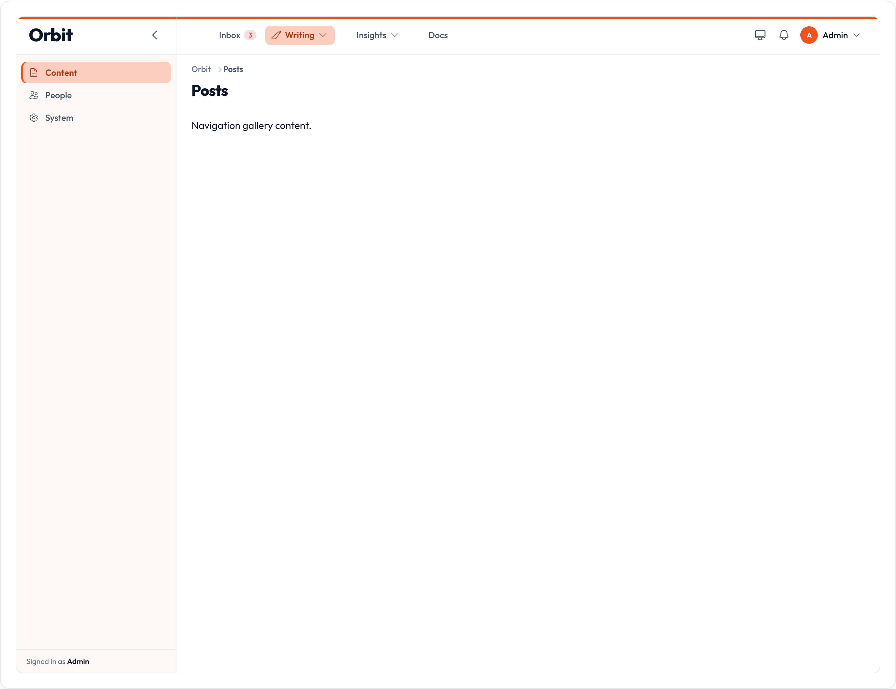
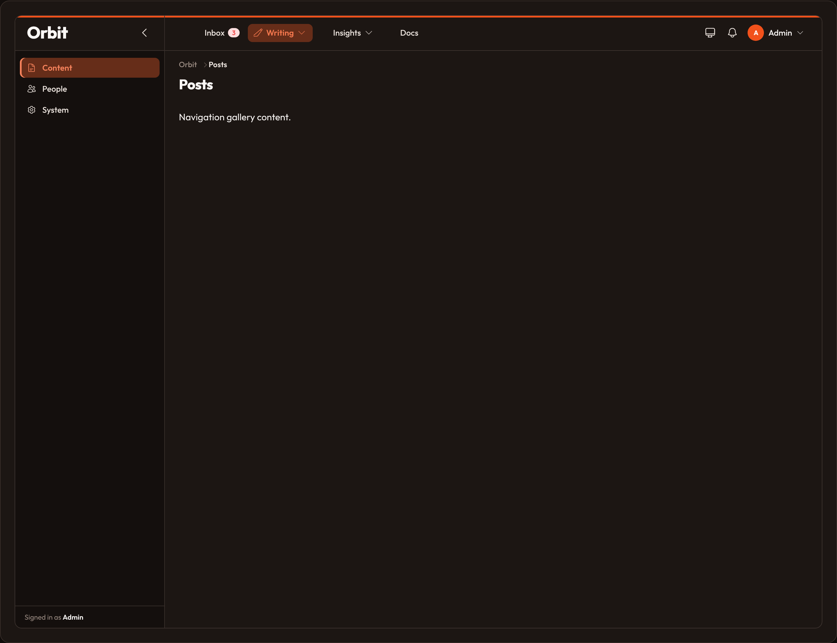
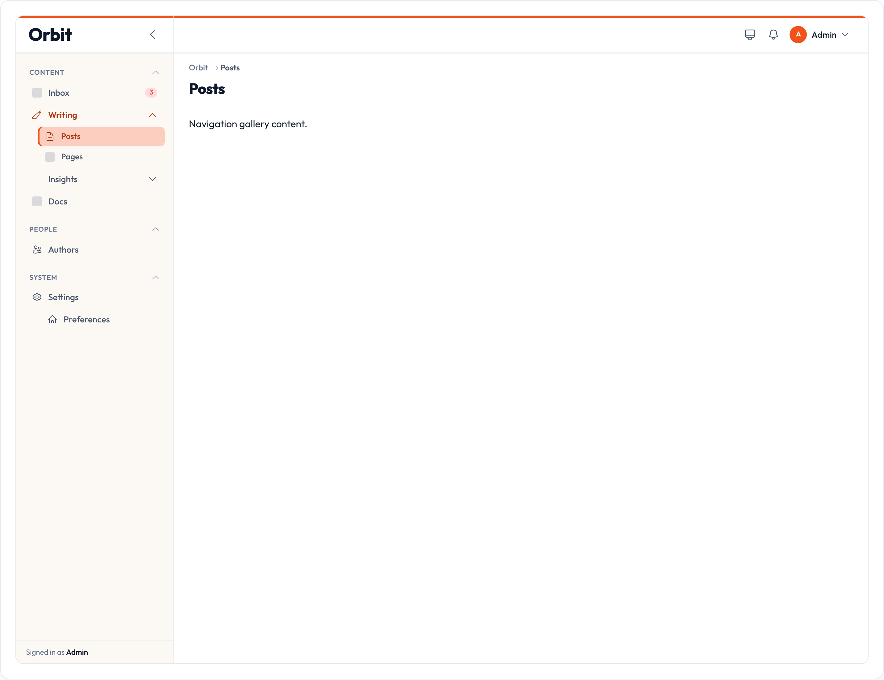
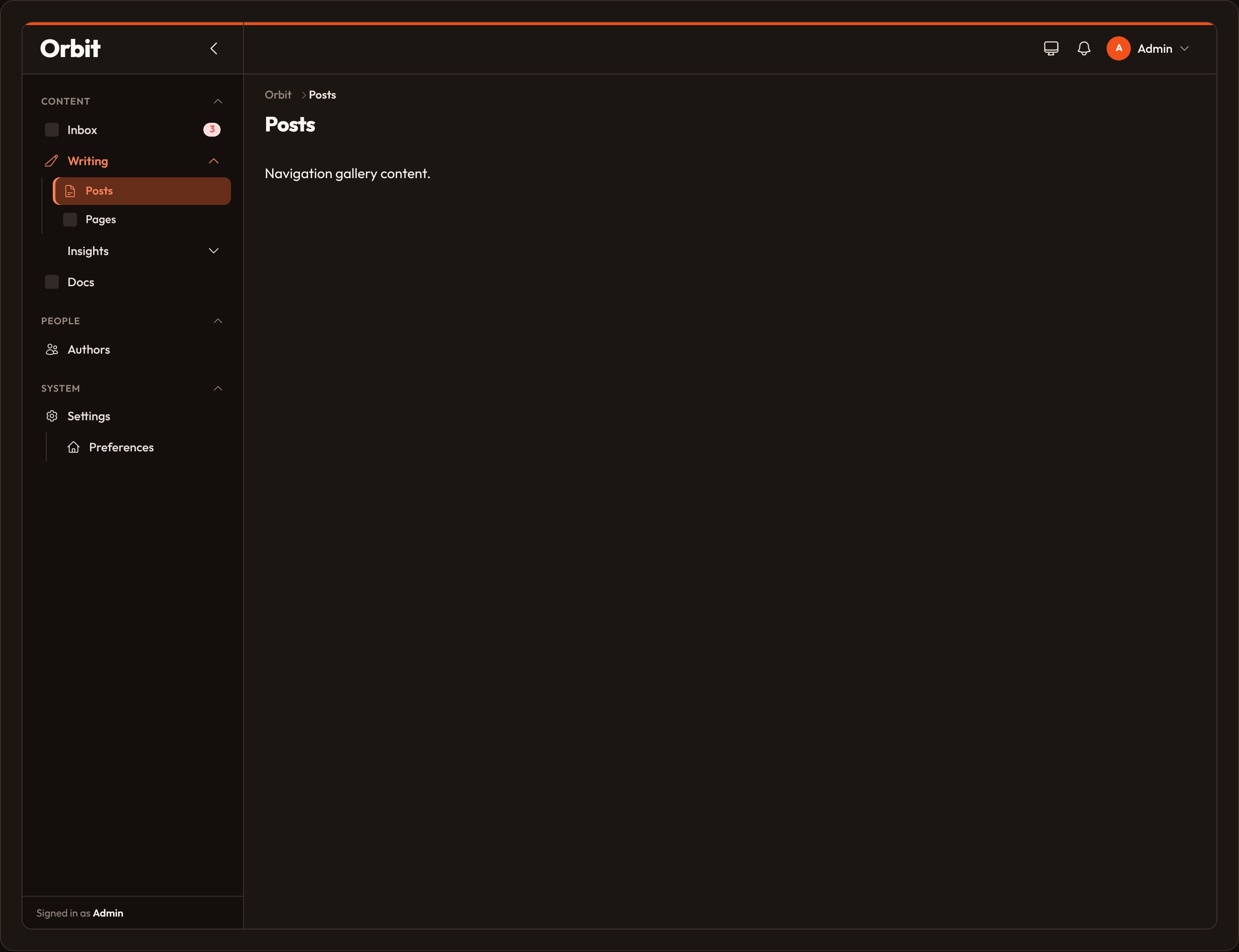
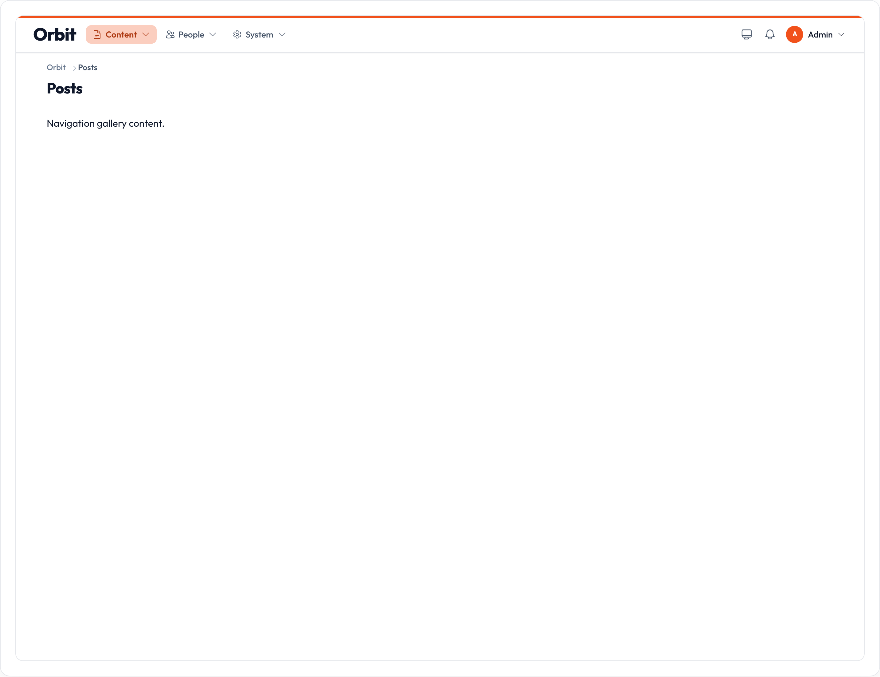
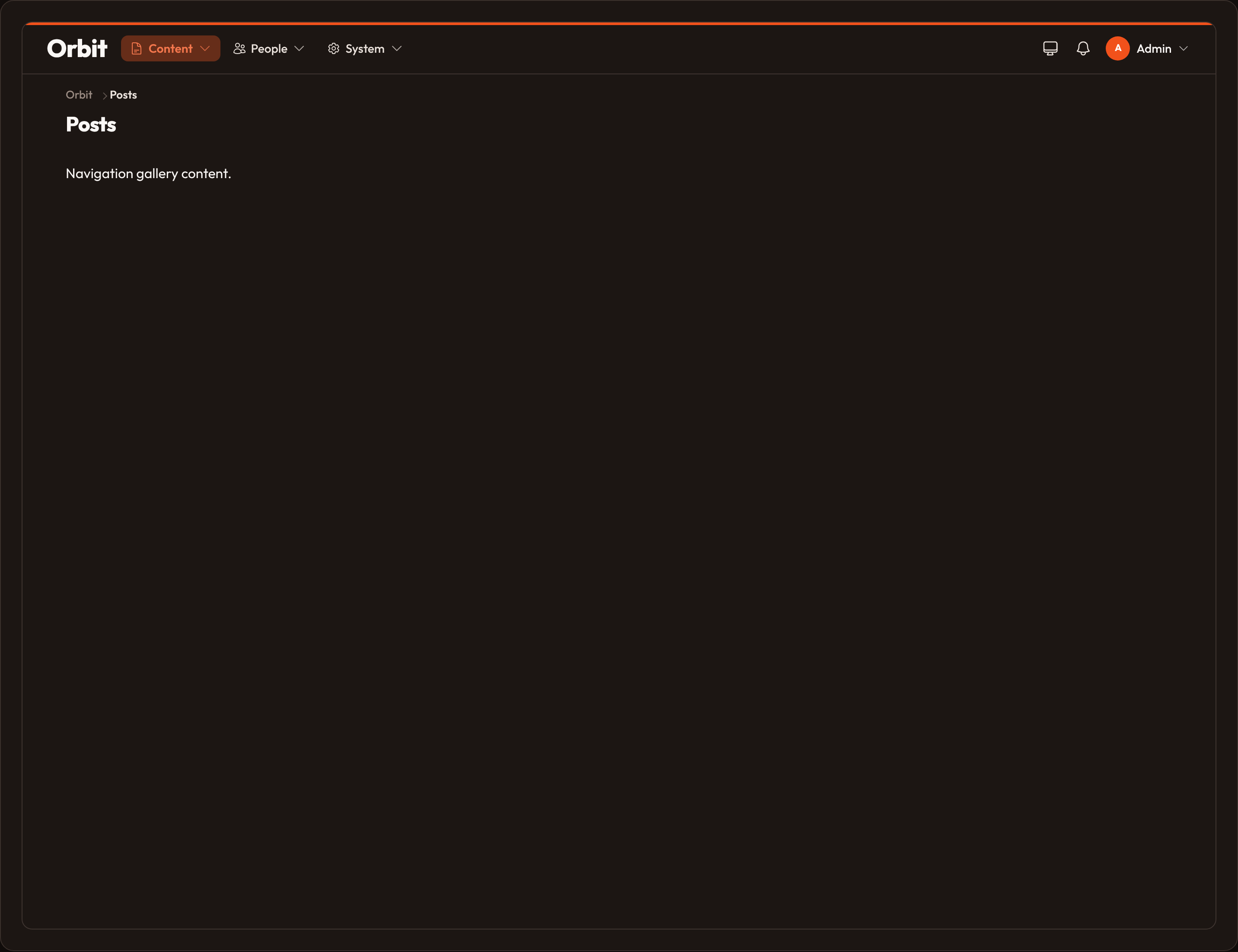
Active matching prefers the longest URL prefix against the current path. Ungrouped items land under a catch-all “Menu” root when using the split layout.
Groups
Section titled “Groups”NavigationGroup is optional. Without it, roots still form from resource/page navigation_group strings (icon falls back to the first item). Register a group when you want a shared icon, sort order, or collapse defaults:
from almasix.orbit.panels import NavigationGroup
NavigationGroup.make("Content")    .icon("heroicon-o-document-text")    .sort(10)    .collapsed()           # start closed    .collapsible(True)     # allow toggle (default)
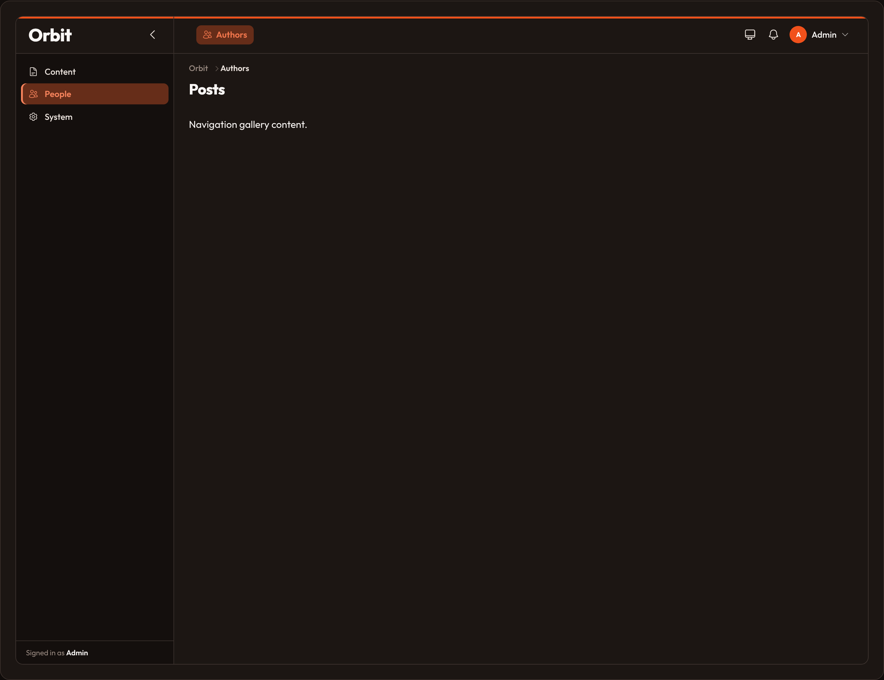
Panel.make("admin")    .path("admin")    .collapsible_navigation_groups()  # panel-wide default    .navigation_groups([        NavigationGroup.make("Content").icon("heroicon-o-document-text").sort(10),        "People",  # label-only — sets group order    ])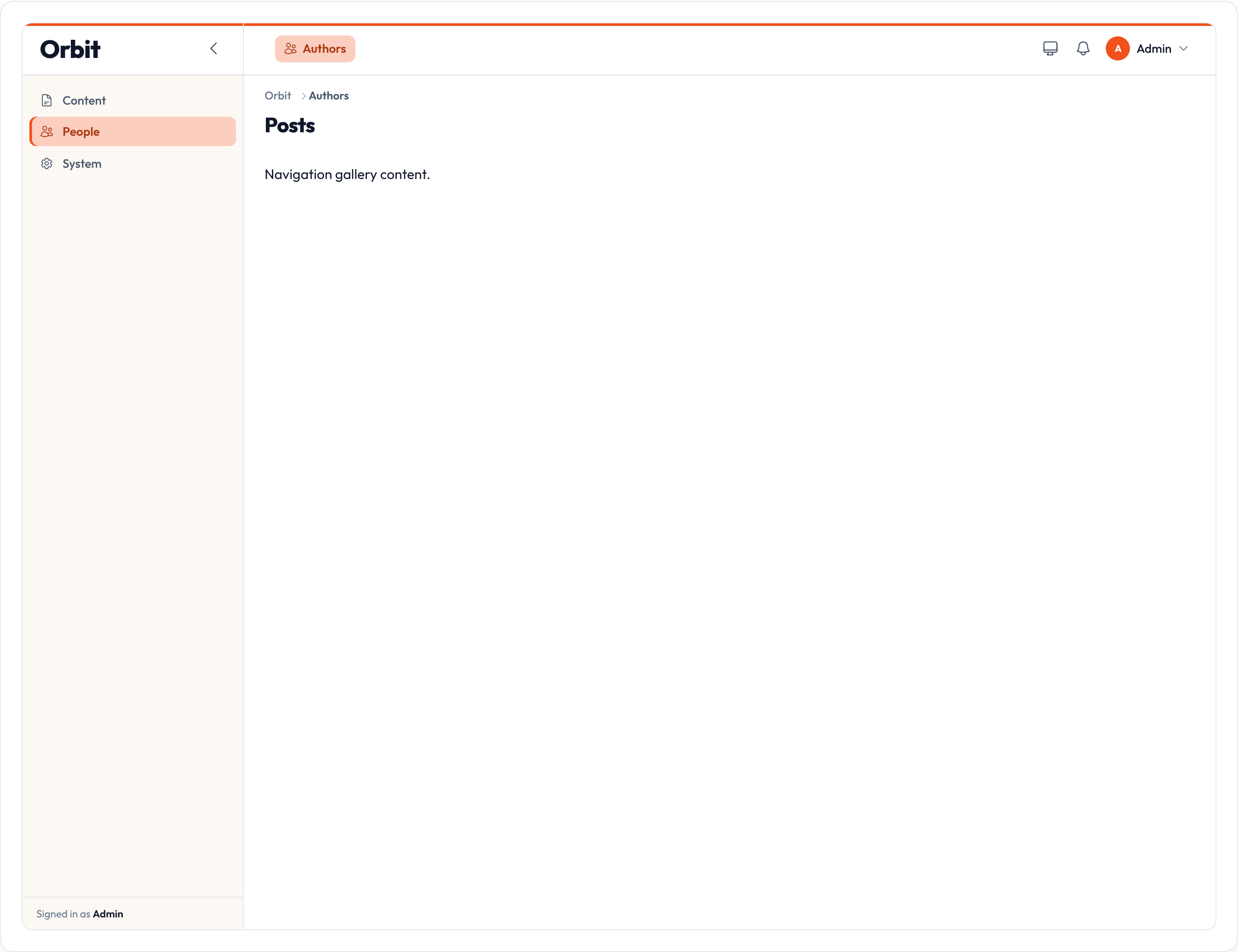
| Method | Notes |
|---|---|
.icon |
Shared group icon (sidebar roots / top dropdowns) |
.sort |
Order among named groups |
.collapsed |
Start collapsed (bool or callable) |
.collapsible |
Whether the group can toggle |
.items |
Nest fluent NavigationItems; also registers them on the panel |
.extra_sidebar_attributes / .extra_topbar_attributes |
Extra HTML attrs on the wrapper |
Subgroups
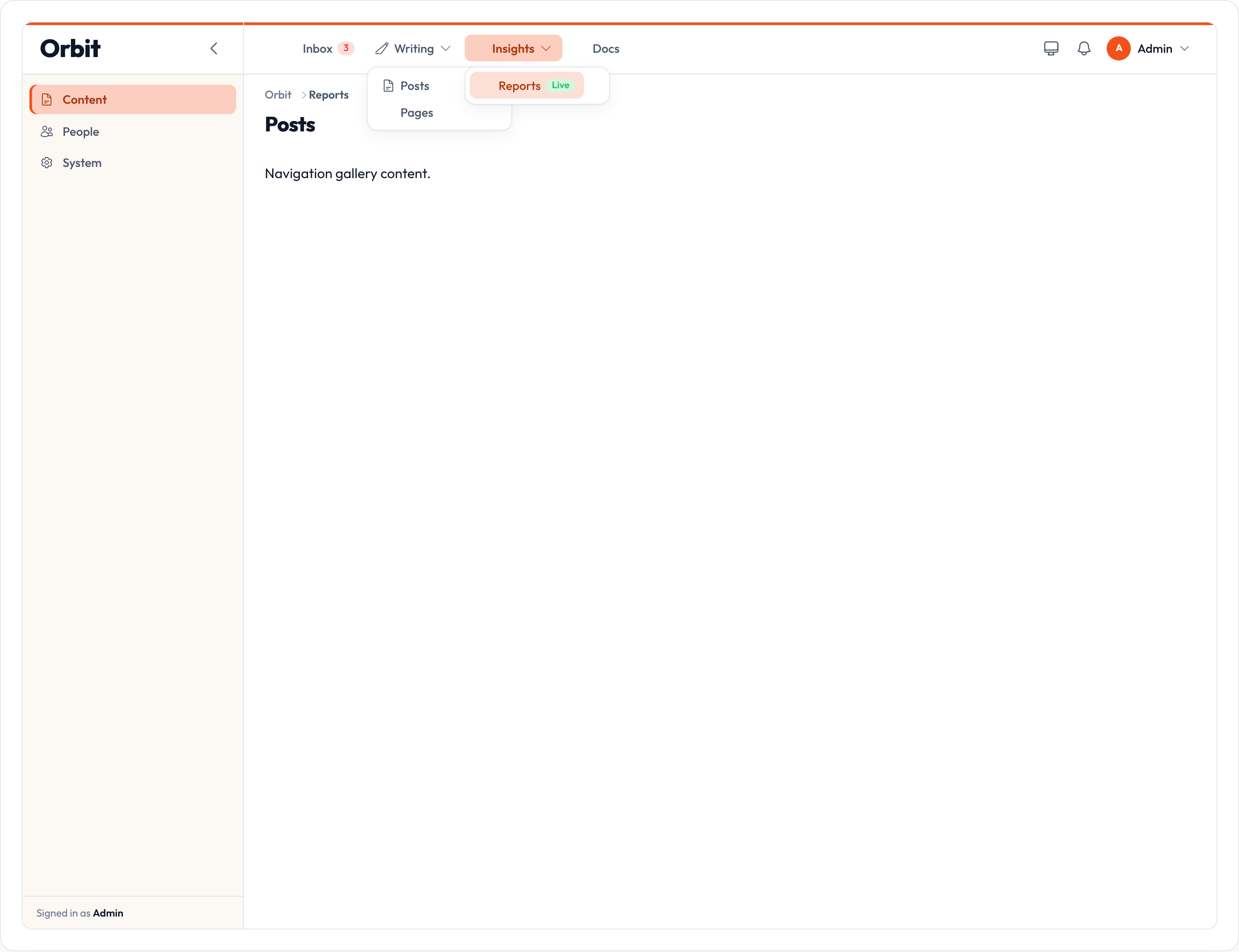
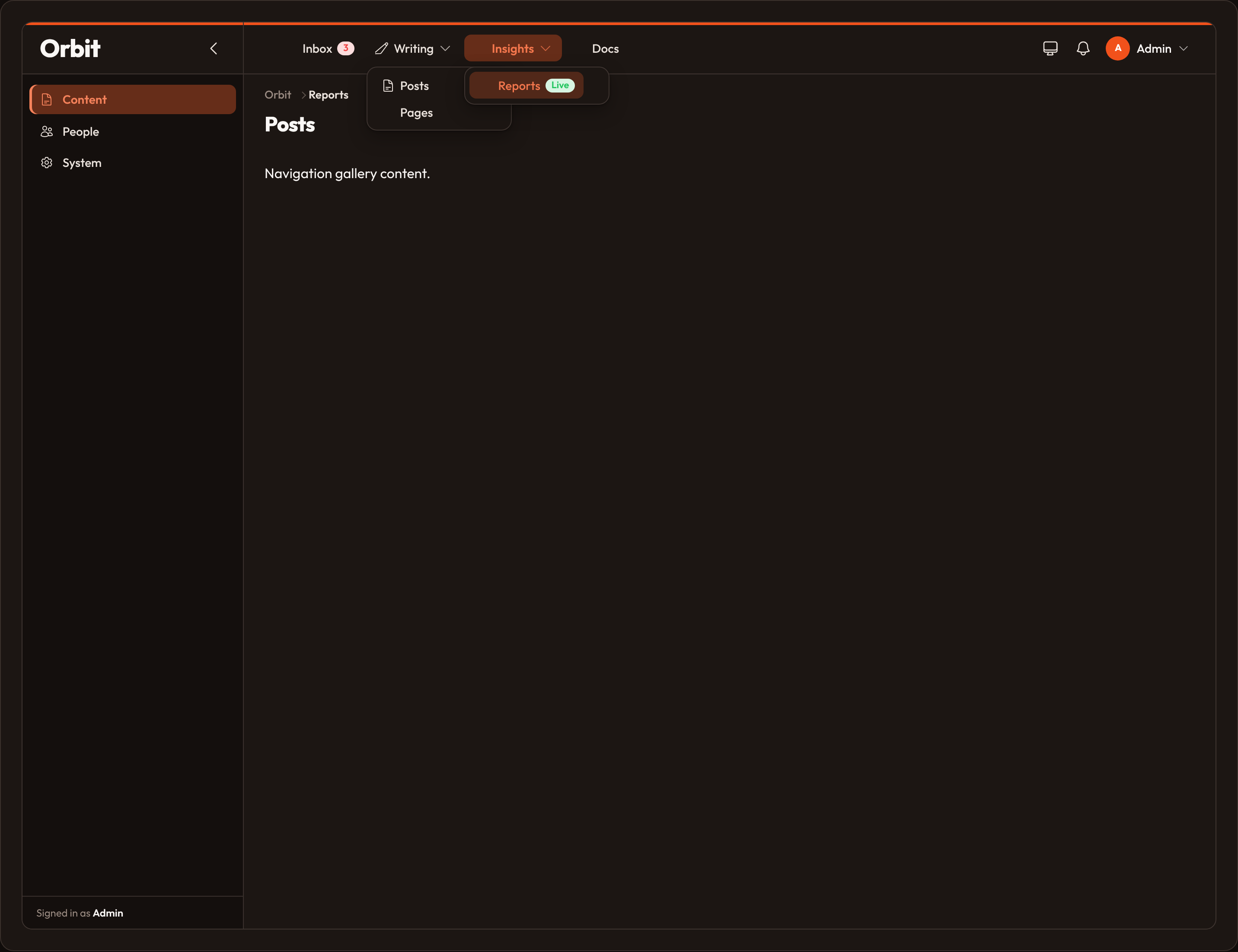
Section titled “Subgroups”NavigationSubgroup is the second nesting level under a group. Register one for a shared icon or sort; otherwise the subgroup name on items is enough.
from almasix.orbit.panels import NavigationSubgroup
NavigationSubgroup.make("Writing") .parent("Content") # omit / None for ungrouped roots .icon("heroicon-o-pencil-square") .sort(5)| Layout | Subgroup behavior |
|---|---|
apps / sidebar_topbar |
Groups top-bar links into a dropdown |
sidebar |
Accordion under the parent group label |
top |
Items ordered under the parent group dropdown |
Badges
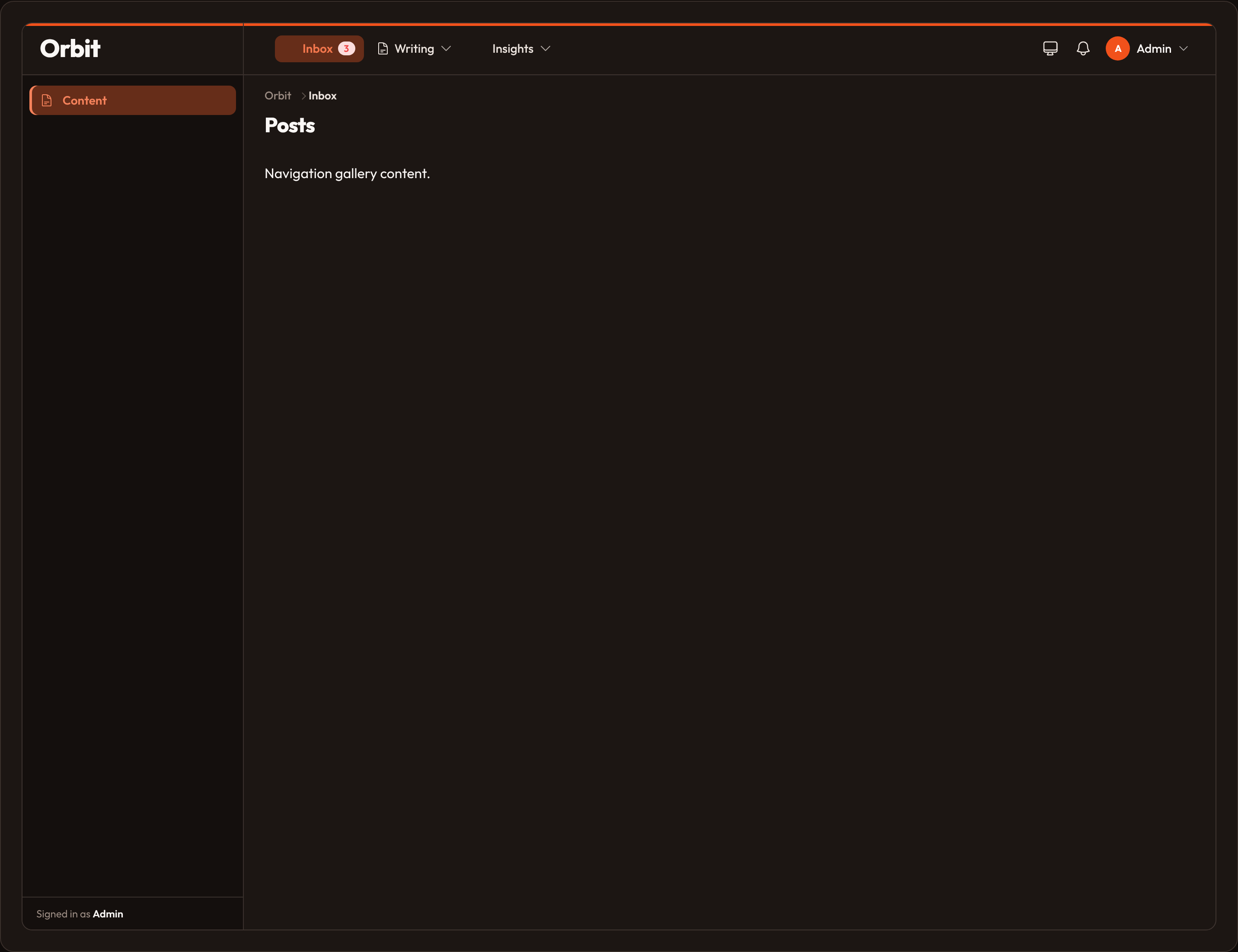
Section titled “Badges”Set navigation_badge (and optional color / tooltip) on a resource or page, or chain .badge(...) on a NavigationItem. Colors mirror Orbit semantic tokens: primary, danger, success, warning, info, gray.
class InboxResource(Resource): navigation_label = "Inbox" navigation_badge = "3" navigation_badge_color = "danger" navigation_badge_tooltip = "Unread"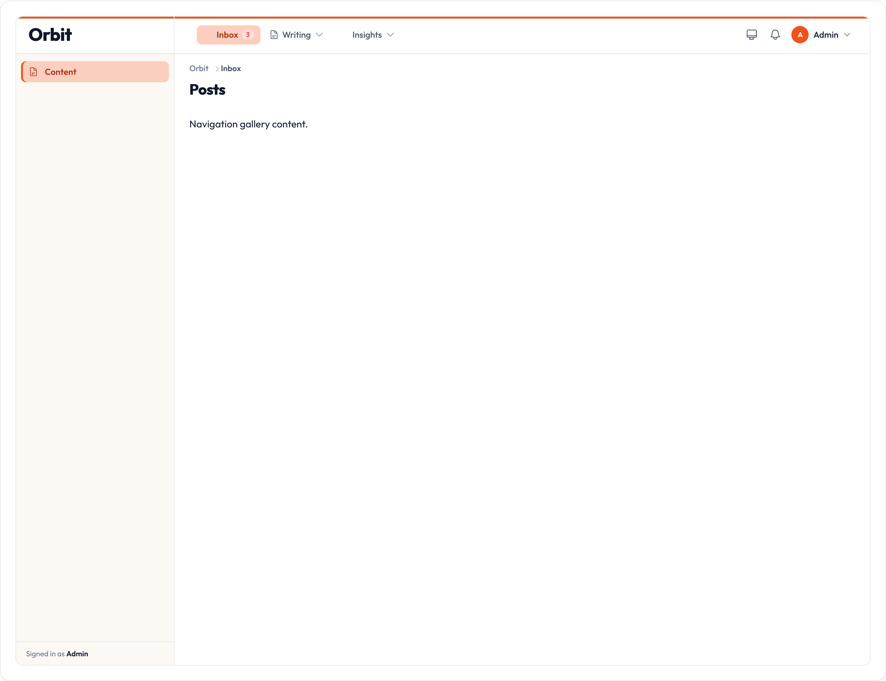
Parent items
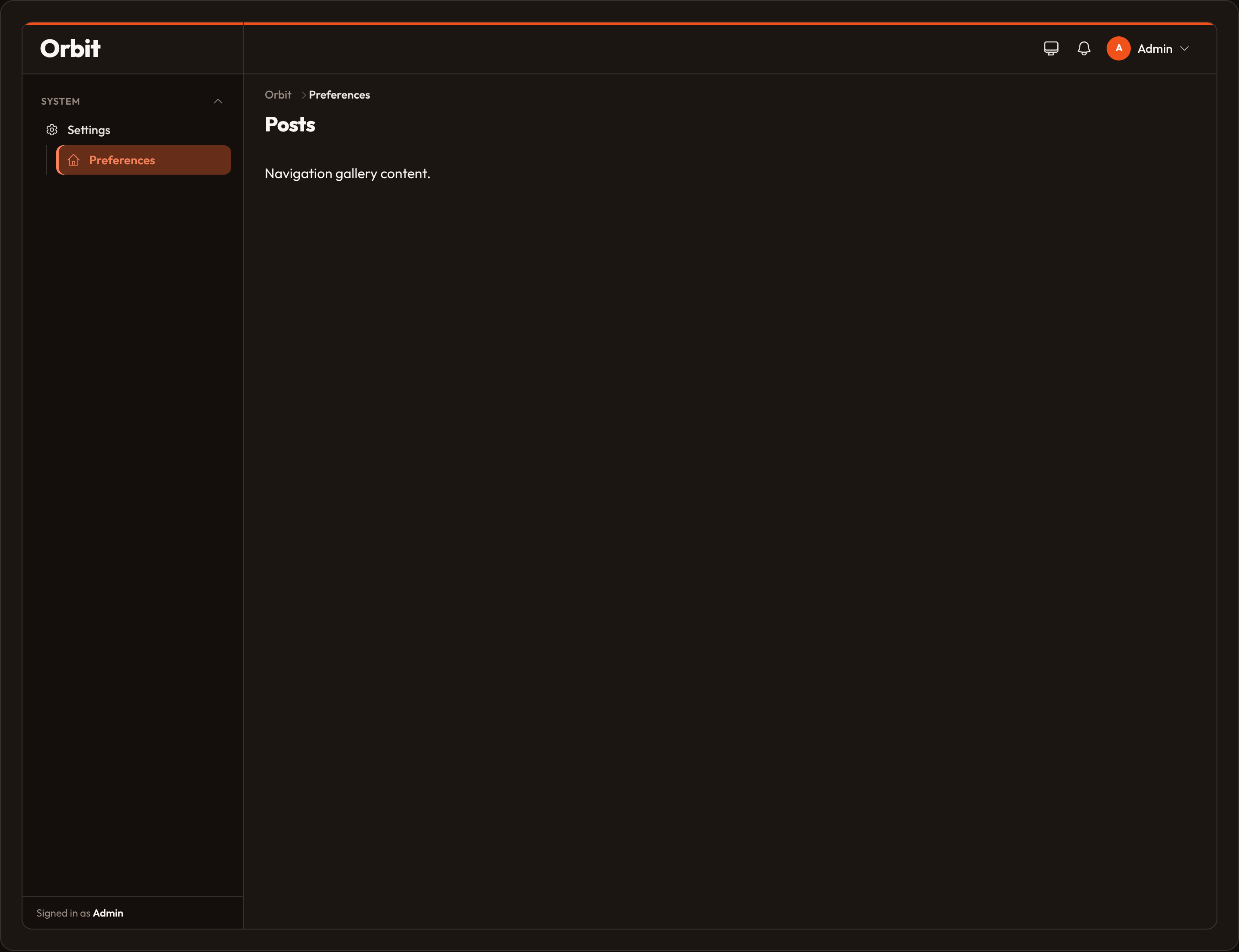
Section titled “Parent items”Nest an item under another by label with navigation_parent_item (or .parent_item(...) on NavigationItem). Parent and child should share the same navigation_group.
class SettingsPage(Page):    navigation_label = "Settings"    navigation_group = "System"    navigation_icon = "heroicon-o-cog-6-tooth"
class PreferencesPage(Page):    navigation_label = "Preferences"    navigation_group = "System"    navigation_parent_item = "Settings"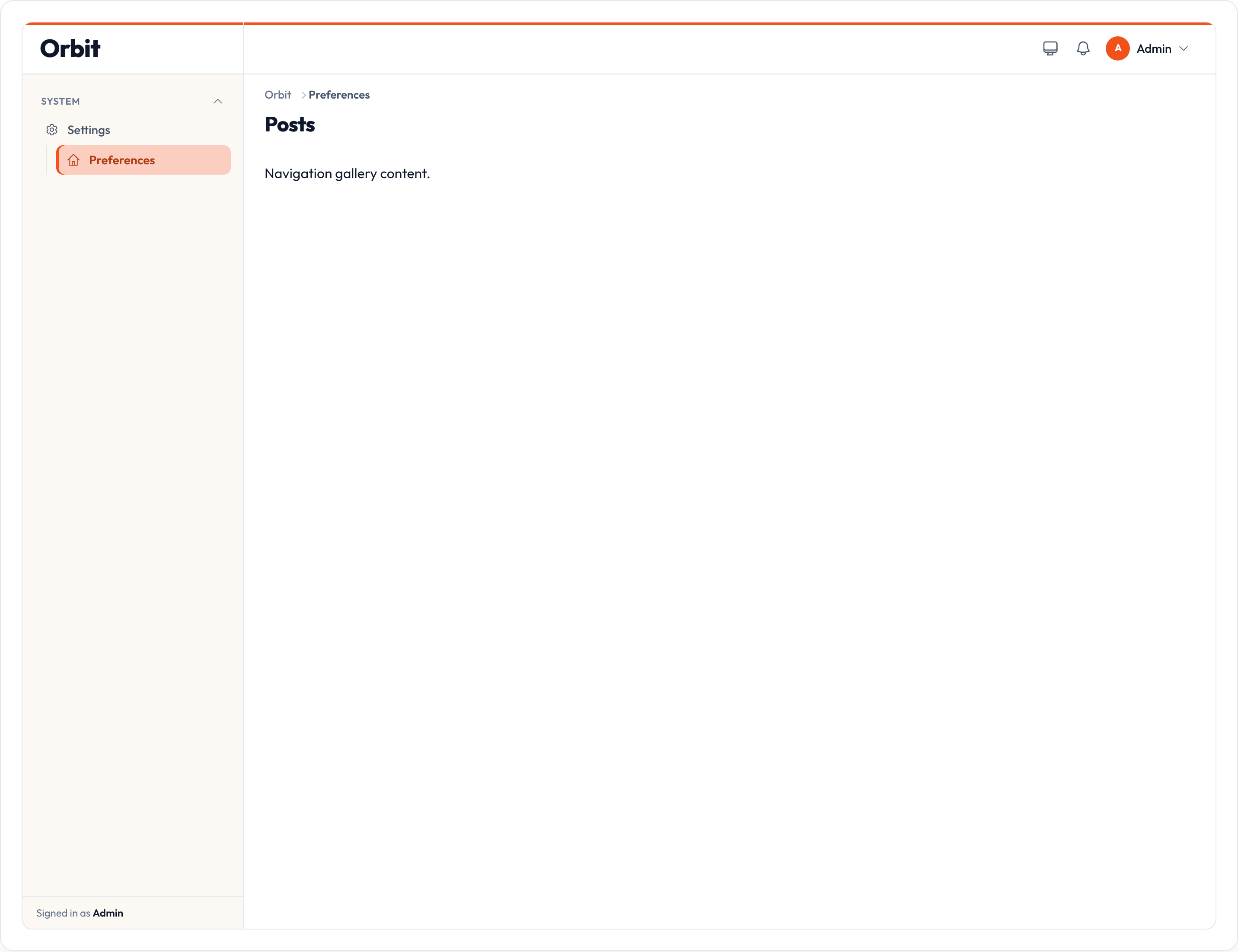
For a third level of hierarchy, prefer Clusters instead of stacking parent items.
Custom NavigationItem
Section titled “Custom NavigationItem”Append hand-built links with .navigation_items([...]) or .navigation_item(...). Call .navigation_items() with no arguments to read the merged collection.
from almasix.orbit.panels import NavigationItem
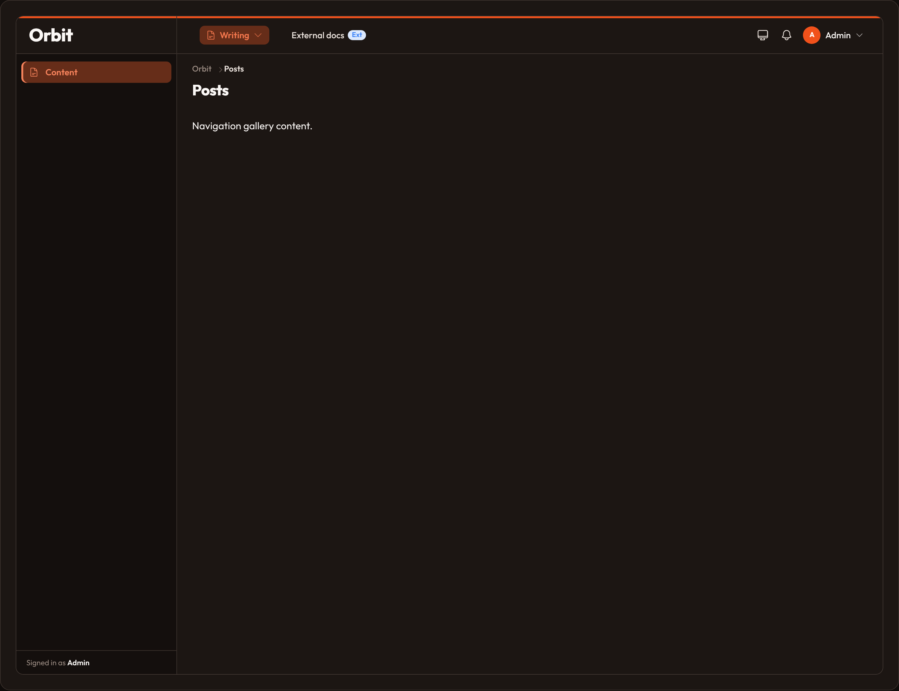
NavigationItem.make("docs")    .label("External docs")    .url("https://example.test/docs")    .icon("heroicon-o-book-open")    .group("Content")    .sort(100)    .open_url_in_new_tab()    .is_active_when(lambda active_path, **_: active_path == "/admin/docs")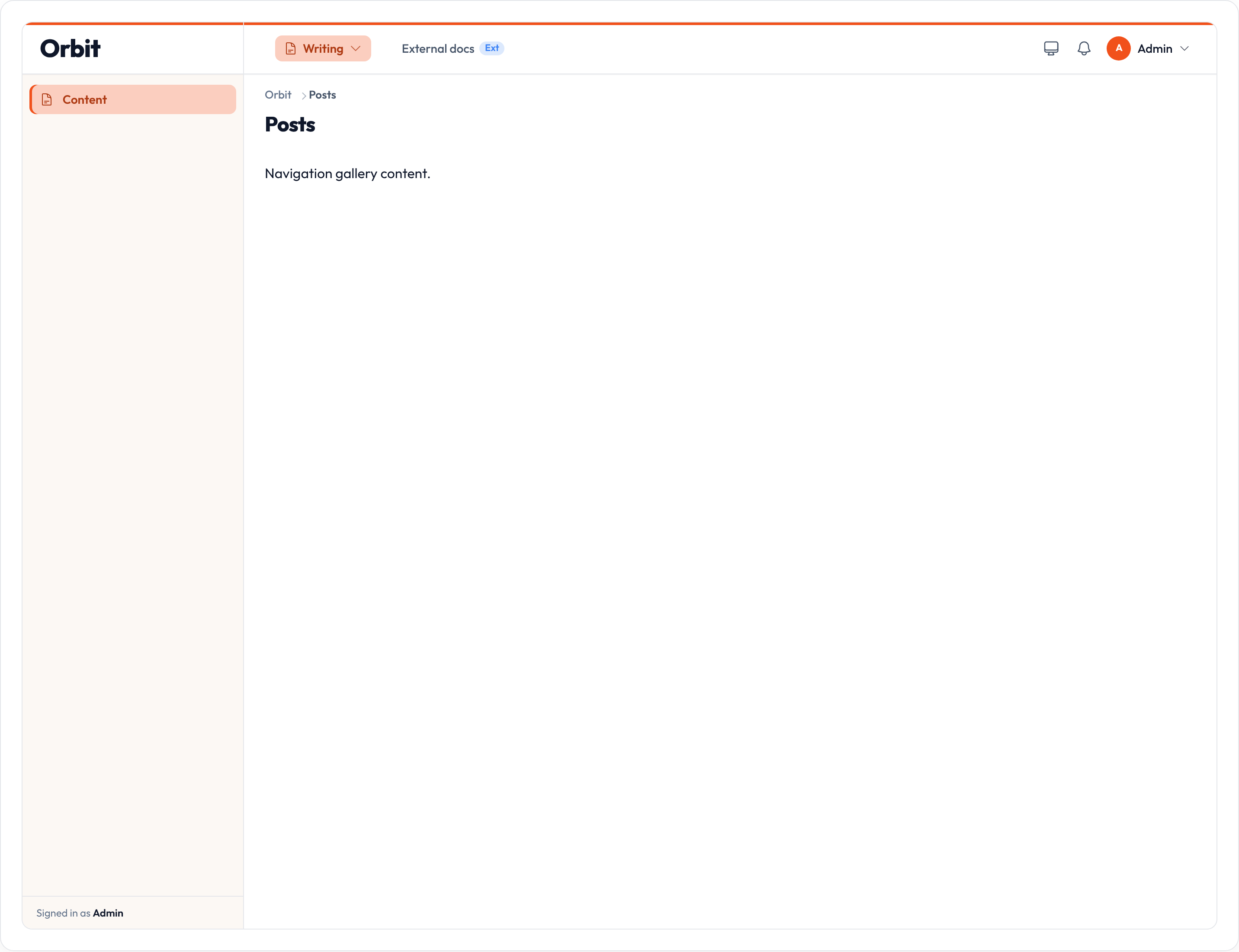
| Method | Notes |
|---|---|
.url |
Destination |
.icon / .active_icon |
Heroicon names |
.group / .subgroup / .sub_category |
Nesting |
.sort |
Order within the group |
.label |
Display text (defaults from the name) |
.badge / .badge_color / .badge_tooltip |
Badge chrome |
.open_url_in_new_tab |
target="_blank" when true |
.is_active_when |
Callable override for active state |
.parent_item |
Nest under another item’s label |
.visible |
Hide when false (from Component) |
Disabling registration
Section titled “Disabling registration”Set should_register_navigation = False (or override get_should_register_navigation) on a resource or page to keep the route but omit the nav link.
class SecretResource(Resource): should_register_navigation = FalseNavigation builder
Section titled “Navigation builder”.navigation(...) disables the nav (False), restores auto collection (True), or replaces items entirely with a NavigationBuilder / callable:
from almasix.orbit.panels import NavigationBuilder, NavigationItem
Panel.make("admin")    .path("admin")    .navigation(        NavigationBuilder.make()            .items([                NavigationItem.make("home")                    .label("Home")                    .url("/admin")                    .icon("heroicon-o-home"),            ])    )
# Or a callable:Panel.make("admin").navigation(    lambda builder: builder.items([        NavigationItem.make("home").label("Home").url("/admin"),    ]))
Panel.make("admin").navigation(False)  # hide chrome nav entirely
Sidebar collapse & width
Section titled “Sidebar collapse & width”Panel.make("admin") .path("admin") .sidebar_collapsible() # icon rail on desktop .sidebar_fully_collapsible_on_desktop() # hide sidebar when collapsed .sidebar_width("18rem") .collapsed_sidebar_width("4.5rem")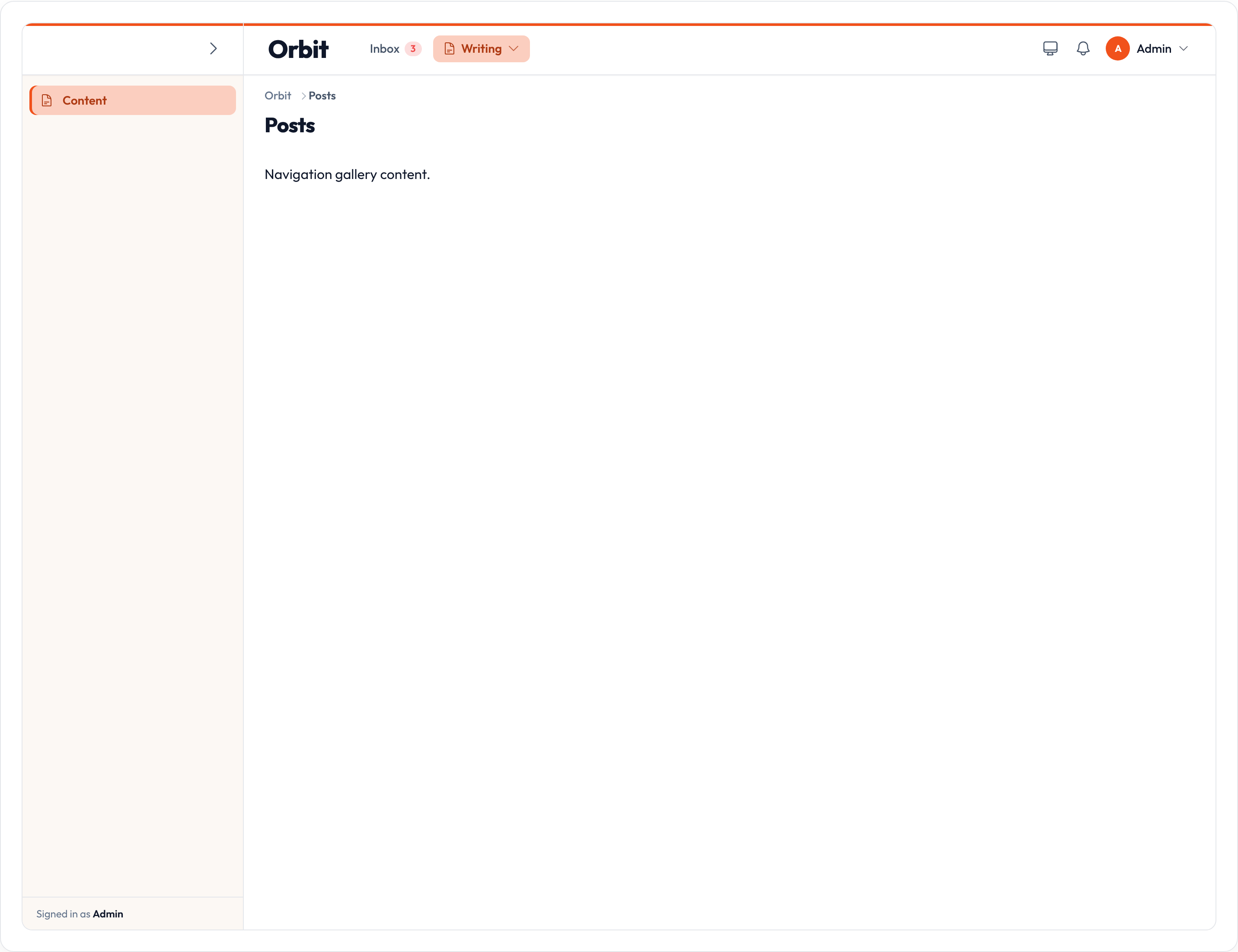
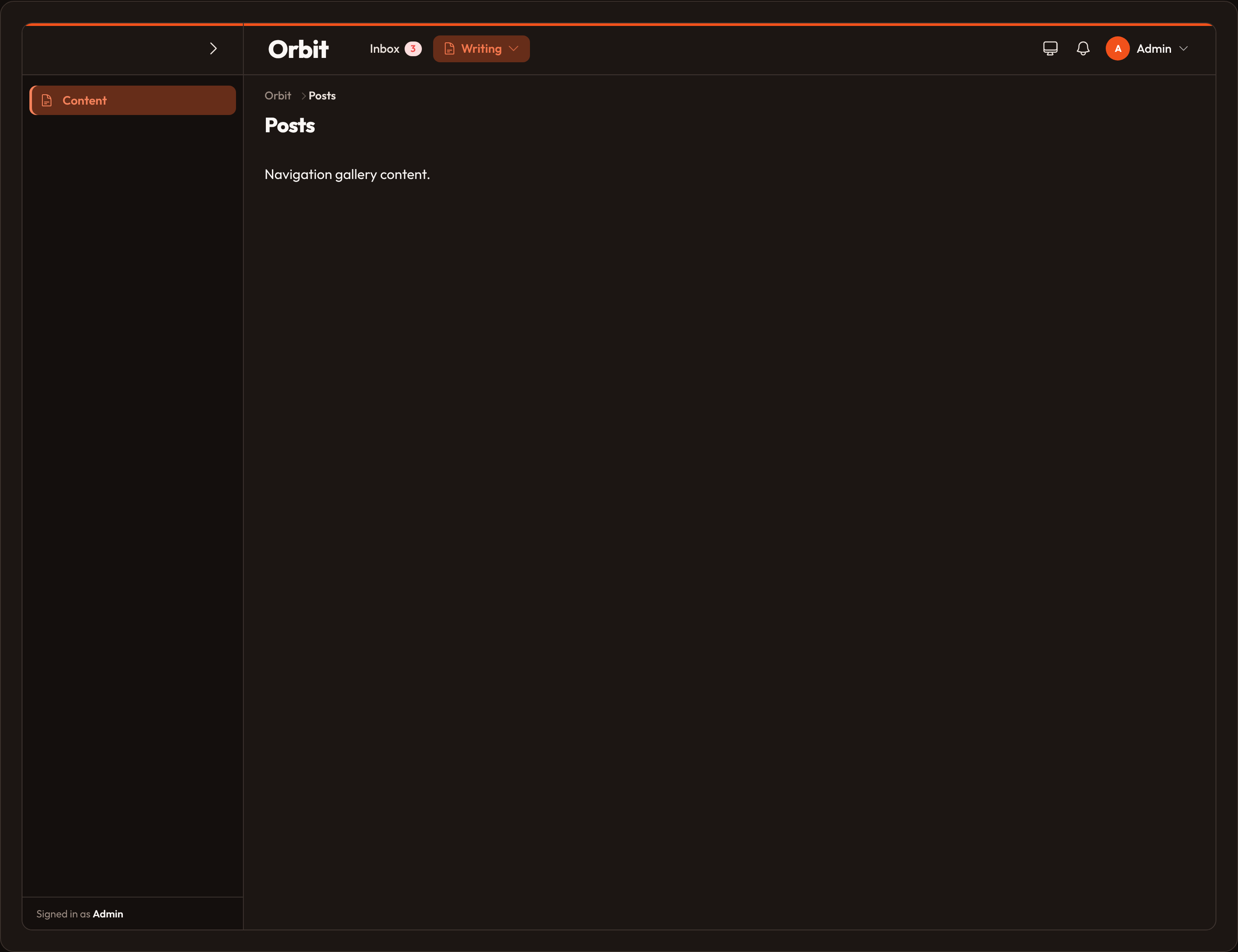
.sidebar_collapsible_on_desktop() is an alias for .sidebar_collapsible().
Breadcrumbs
Section titled “Breadcrumbs”Breadcrumbs are on by default. Toggle with .breadcrumbs_enabled(False). Cluster-aware trails include the cluster breadcrumb — see Clusters.