

Sections
Introduction
Section titled “Introduction”Section is the primary titled panel for forms and infolists. Put related fields under a heading, optionally add a description and icon, then nest any schema children — grids, flex rows, fields, or primes.
from almasix.orbit.schemas import Sectionfrom almasix.orbit.forms import TextInput
Section.make("profile")    .heading("Profile")    .description("Public details for this account.")    .icon("heroicon-o-user")    .schema([        TextInput.make("name").label("Name"),        TextInput.make("bio").label("Bio"),    ])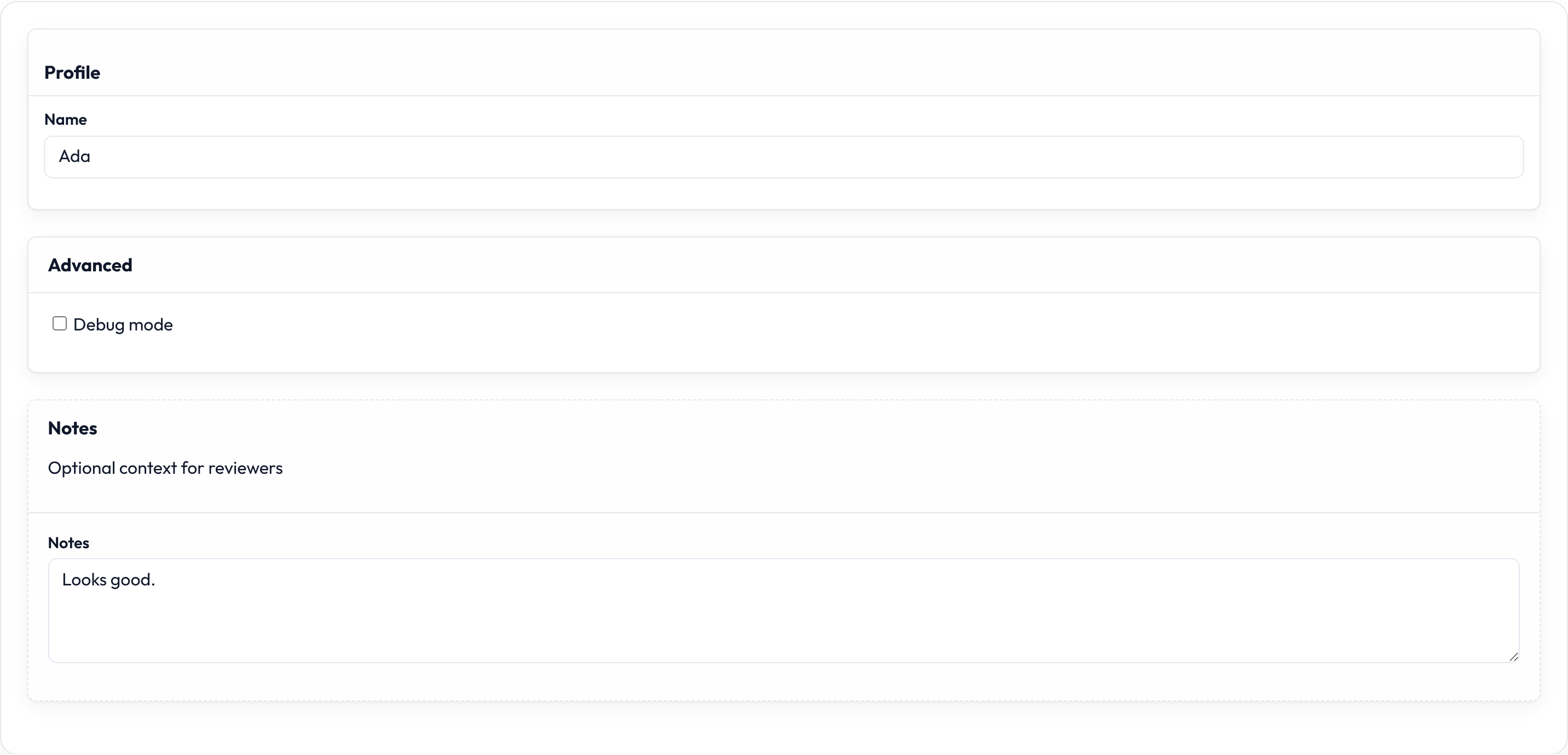
Basic section
Section titled “Basic section”Heading plus nested schema:
Section.make("profile") .heading("Profile") .schema([TextInput.make("name").label("Name")])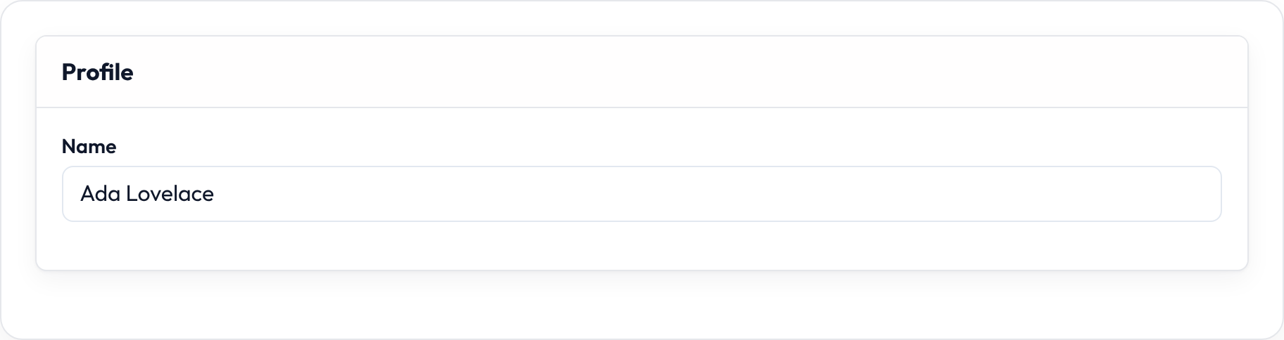
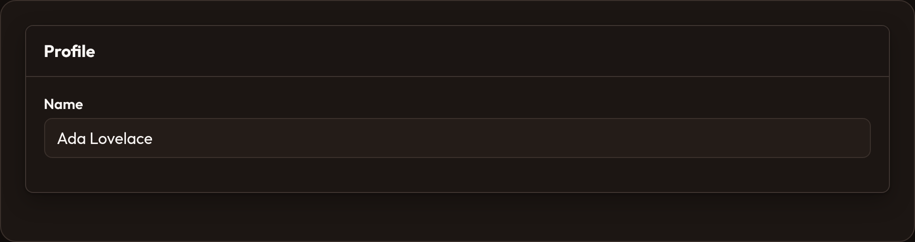
If you omit .heading(...), the section falls back to .label(...) / the component name for the title.
Description and icon
Section titled “Description and icon”Section.make("billing") .heading("Billing") .description("Invoices are emailed on the 1st of each month.") .icon("heroicon-o-credit-card") .schema([...])Collapsible section
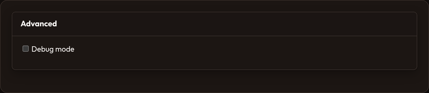
Section titled “Collapsible section”Make the body toggle open/closed. Pair .collapsed() when advanced blocks should start shut:
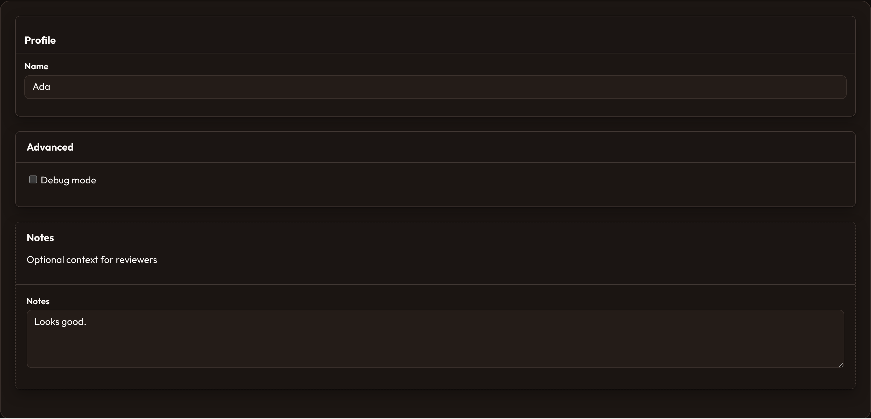
Section.make("advanced") .heading("Advanced") .collapsible() .collapsed() .schema([Toggle.make("debug")])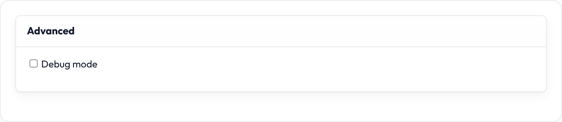
Persist collapsed state
Section titled “Persist collapsed state”Remember open/closed across visits via data-persist-collapsed (keyed by the section name):
Section.make("advanced") .heading("Advanced") .collapsible() .persist_collapsed() .schema([...])Compact section
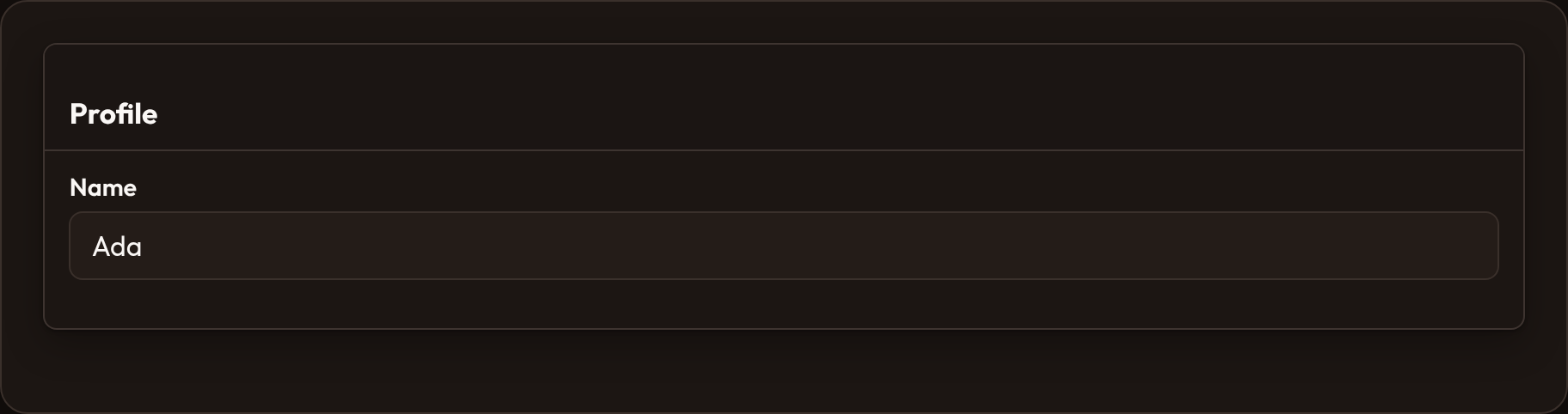
Section titled “Compact section”Tighten vertical rhythm for dense admin forms:
Section.make("profile") .heading("Profile") .compact() .icon("heroicon-o-user") .schema([...])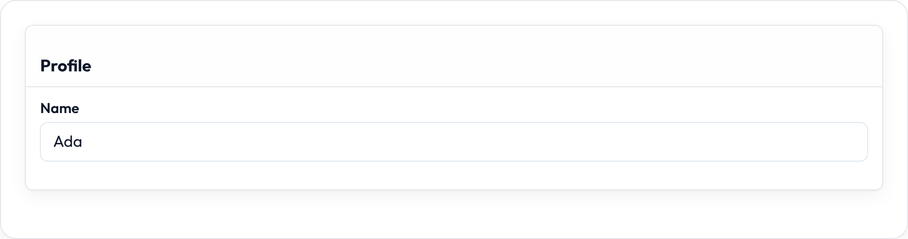
Aside and secondary
Section titled “Aside and secondary”.aside() shifts chrome toward a sidebar-style layout. .secondary() uses muted / secondary styling:
Section.make("meta") .heading("Metadata") .aside() .secondary() .schema([TextInput.make("slug")])API reference
Section titled “API reference”| Method | Role |
|---|---|
.heading |
Section title |
.description |
Muted copy under the title |
.icon |
Heroicon (or registered icon) beside the title |
.collapsible |
Enable open/close toggle |
.collapsed |
Start collapsed (usually with .collapsible) |
.persist_collapsed |
Persist open/closed in the host |
.compact |
Denser spacing |
.aside |
Aside / sidebar chrome |
.secondary |
Muted secondary chrome |
.schema |
Nested child components |
Shared layout helpers also apply: .dense, .gap, .defer_loading — see Layouts.