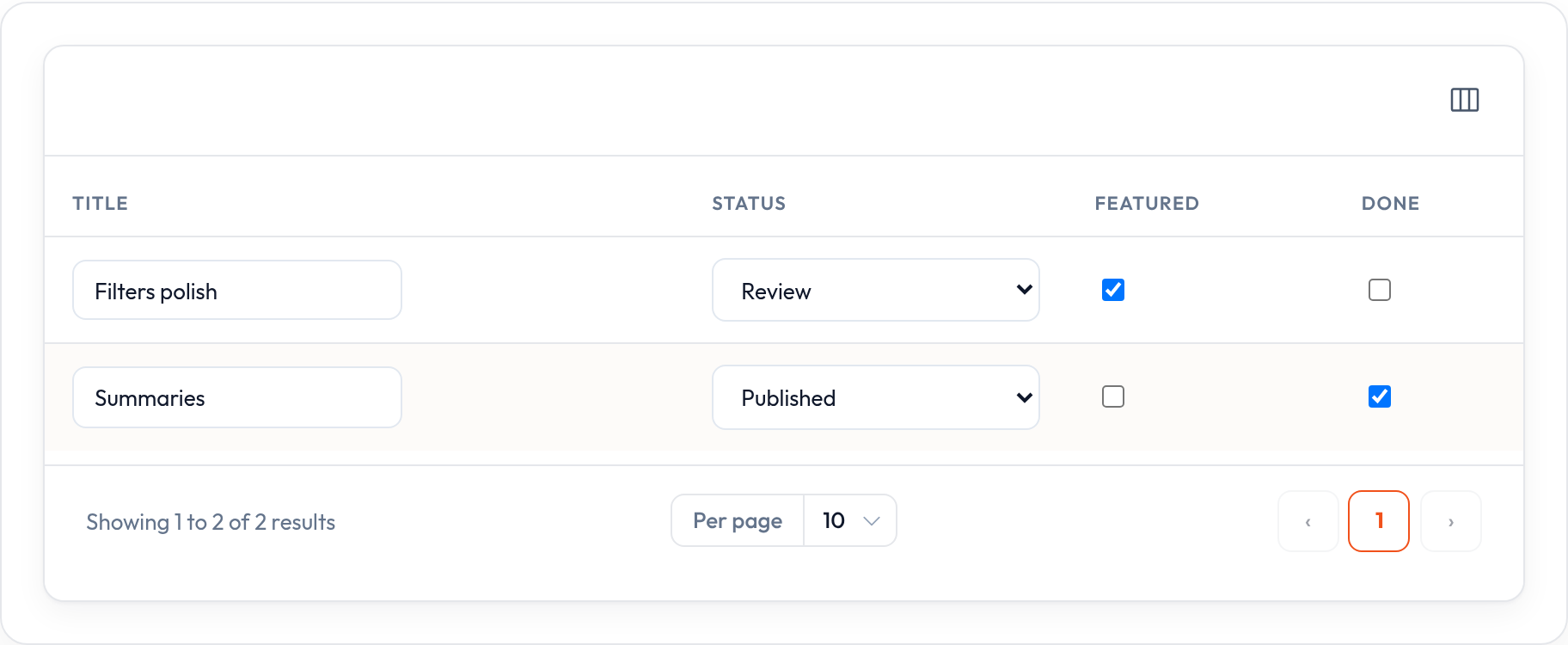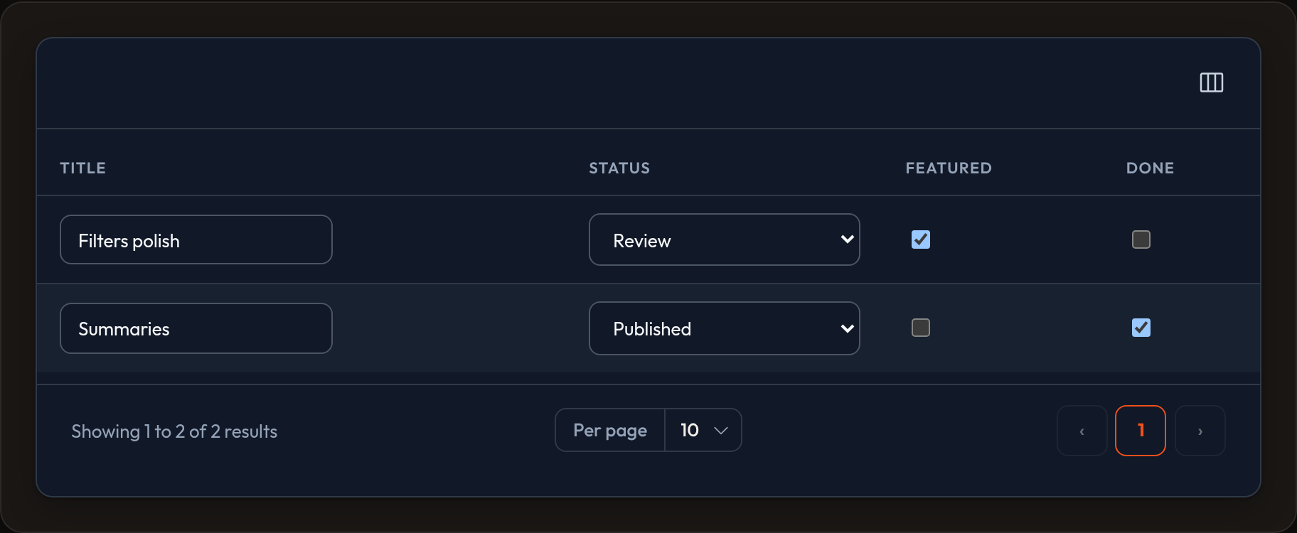

Checkbox column
CheckboxColumn renders an inline checkbox for boolean fields. It uses the same editable-column pipeline as select, toggle, and text input.
SelectColumn, TextInputColumn, ToggleColumn, CheckboxColumn# persist via ListRecordsHost.update_column_state / orbit.jsUse ToggleColumn for a switch control. Use CheckboxColumn for a standard checkbox (for example permissions or approval flags).
Standalone example
Section titled “Standalone example”from almasix.orbit.tables import Table, TextColumn, CheckboxColumn
table = ( Table.make("reviews") .columns([ TextColumn.make("title").searchable(), CheckboxColumn.make("approved").label("OK"), CheckboxColumn.make("spam"), ]) .records(records))In a Resource example
Section titled “In a Resource example”from almasix.orbit import Resourcefrom almasix.orbit.tables import Table, TextColumn, CheckboxColumn
class ReviewResource(Resource): @classmethod def table(cls, table: Table) -> Table: return table.columns([ TextColumn.make("title").searchable().sortable(), CheckboxColumn.make("approved").align_center(), CheckboxColumn.make("featured") .disabled(lambda record=None, **_: not record.get("approved")), ])For read-only booleans, use BooleanColumn or TextColumn.boolean(). Use CheckboxColumn when operators should change the value from the index.
Key methods
Section titled “Key methods”.disabled(bool | callable)— prevent changes.label(...)/.align_center()/.sortable()- Markup:
data-orbit-column-edit="checkbox",data-record-id,data-column - Class:
or-checkbox
Preview
Section titled “Preview”