
Boolean column
Boolean values can render as icons or as Yes/No text.
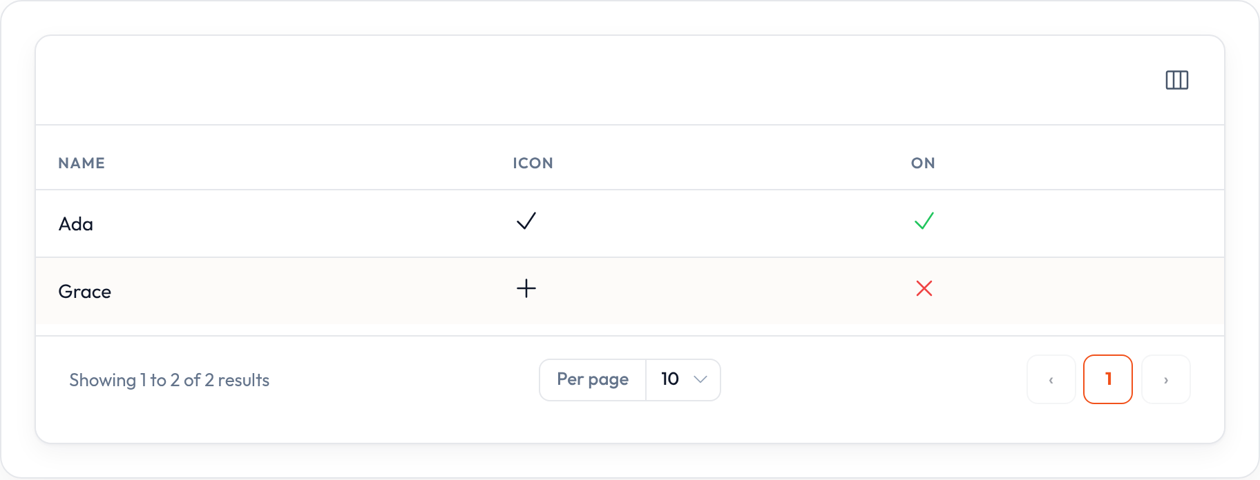
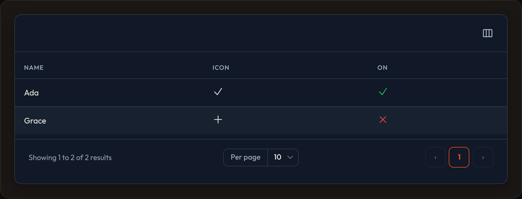
BooleanColumn is the Filament-shaped alias for IconColumn with .boolean() already applied — check and X icons with success and danger colors.
Standalone example
Section titled “Standalone example”from almasix.orbit.tables import Table, TextColumn, BooleanColumn, IconColumn
table = ( Table.make("features") .columns([ TextColumn.make("name").searchable(), # Icon check / X (BooleanColumn ≡ IconColumn.boolean) BooleanColumn.make("enabled"), IconColumn.make("verified").boolean() .true_icon("heroicon-o-check-circle") .false_icon("heroicon-o-x-circle"), # Plain Yes / No text TextColumn.make("featured").boolean(), ]) .records(records))In a Resource example
Section titled “In a Resource example”from almasix.orbit import Resourcefrom almasix.orbit.tables import Table, BooleanColumn, IconColumn, TextColumn
class FeatureResource(Resource): @classmethod def table(cls, table: Table) -> Table: return table.columns([ TextColumn.make("name").searchable().sortable(), BooleanColumn.make("enabled").sortable().align_center(), IconColumn.make("public").boolean().color( lambda state=None, **_: "success" if state else "gray" ), TextColumn.make("beta").boolean().label("Beta?"), ])Which to use
Section titled “Which to use”| API | Renders |
|---|---|
BooleanColumn.make(...) |
Check / X icons |
IconColumn.make(...).boolean() |
Same icons (customize with .true_icon / .false_icon) |
TextColumn.make(...).boolean() |
"Yes" / "No" text |
Key methods
Section titled “Key methods”.boolean()— switch icon (or text) mode on.true_icon(...)/.false_icon(...)— Heroicon names (IconColumn).size(...)— icon size class.color(str | callable)— override default success/danger.sortable()/.align_center()
Preview
Section titled “Preview”